
Products Block
Use the Products block to configure and visualize recommended products in the email.
ImportantThe Products block is available when you have at least one order in your account.
Before working with the block, you need to:
- Connect one of the advanced features pricing plans.
- Set up web tracking
- Create a data source for recommendations
NoteIf no product feed is available, the editor can use up to 10 sample products generated from your website during Brand Kit setup. Sample products help you design the email but are not used as real product data when the message is sent.
Block Configuration
To add the Products block to the email content, drag and drop it to the content area.
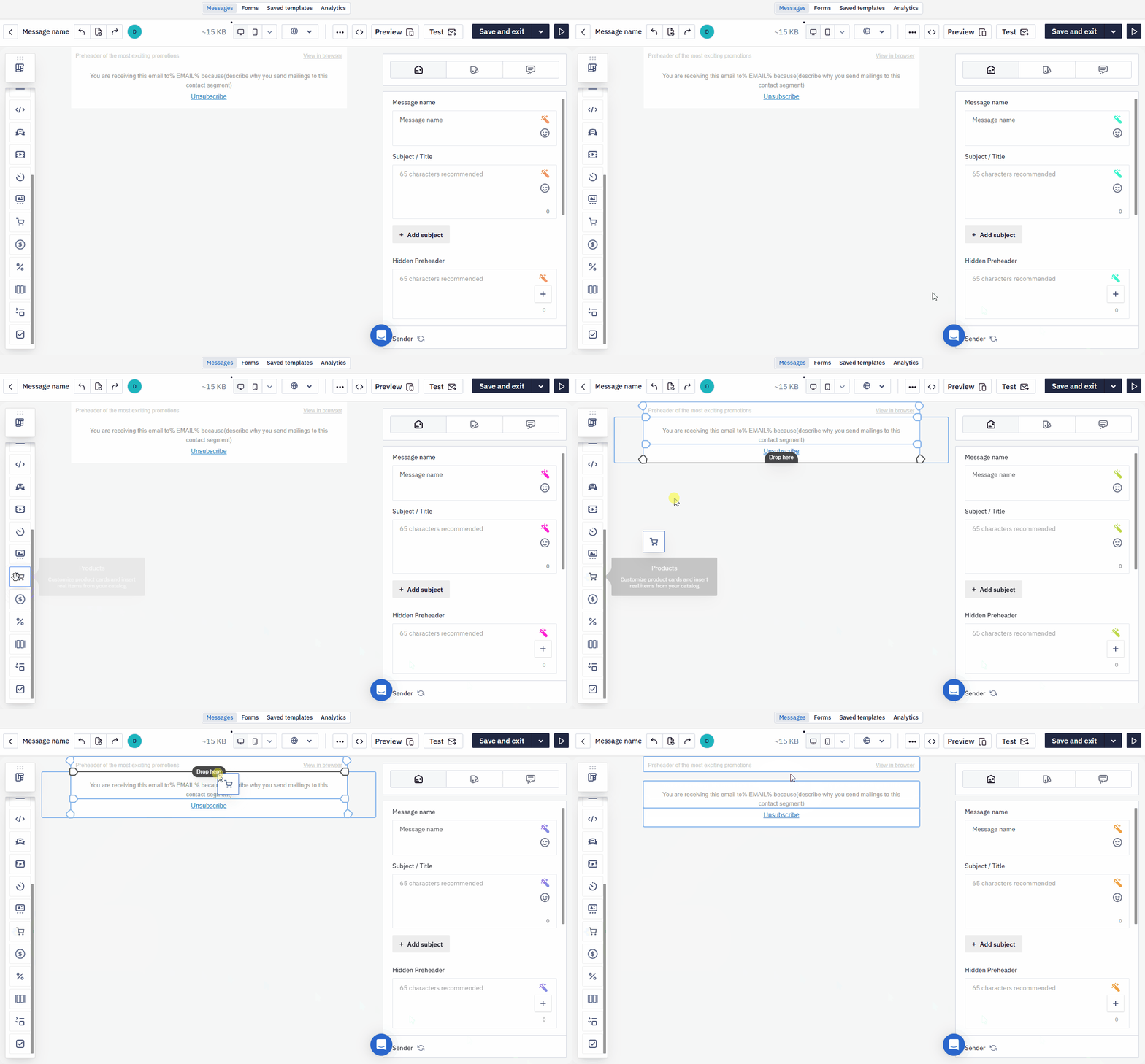
Click the block in the message container. The following tabs will open on the sidebar:
- Product list
- Modules
- Data
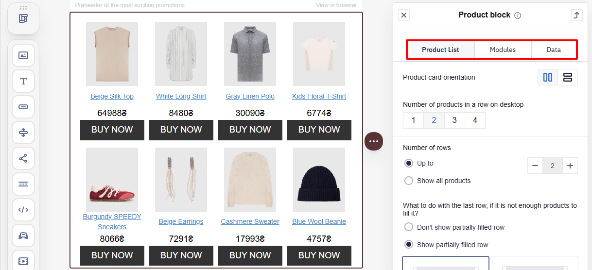
Next, review the tabs and their purpose.
Use the buttons on the Email Management Panel to switch between desktop and mobile versions.

Product List
Configure the number of product cards in the block and their alignment, placement, padding, and background.
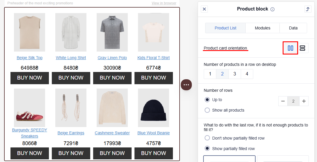
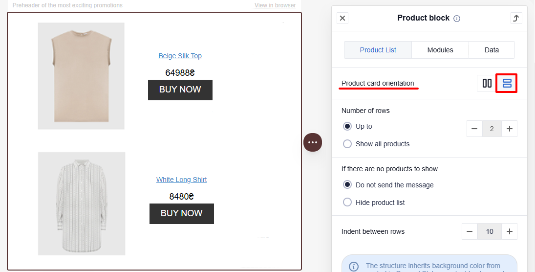
Product card orientation
- Vertical
- Horizontal
Number of products in a row (for vertical orientation)
Set the number of products to display in a single row
- Desktop — 1 to 4
- Mobile — 1 to 3
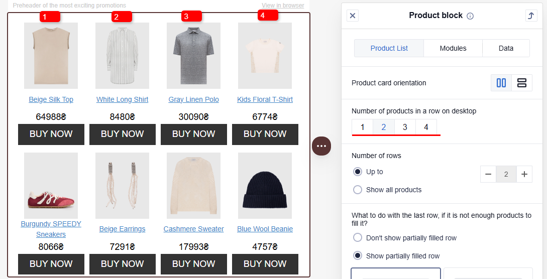
Number of rows
Enter the number of rows with products in the Up to parameter using the +/– buttons.
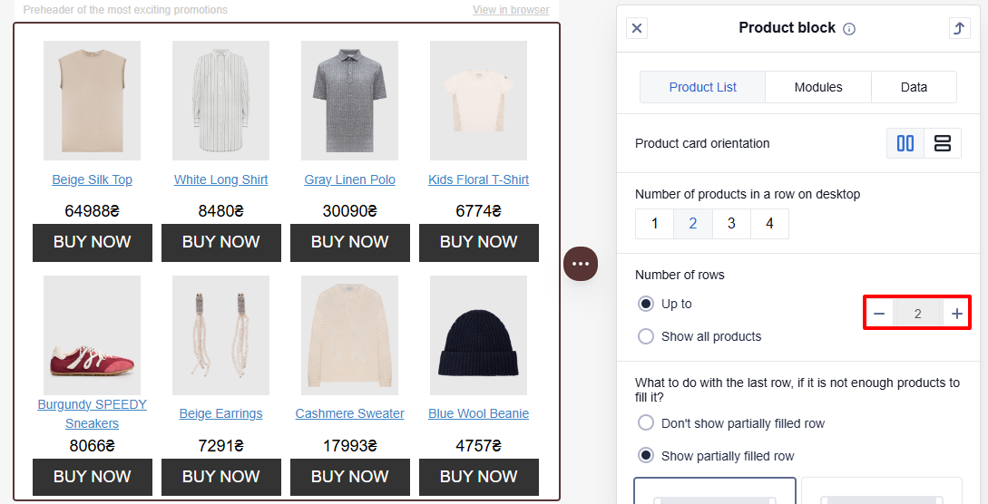
NotePossible values range from 1 to 50 rows. If there are not enough products to fill all the rows, the system may display only 1 row.
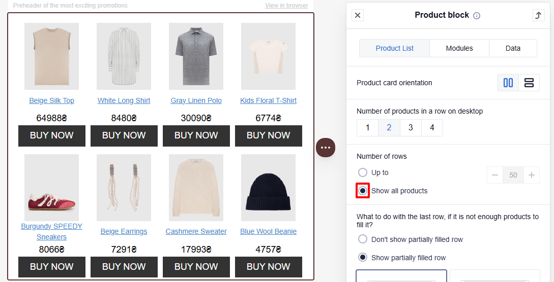
To show all the products available in the data source, select the Show all products radio button.
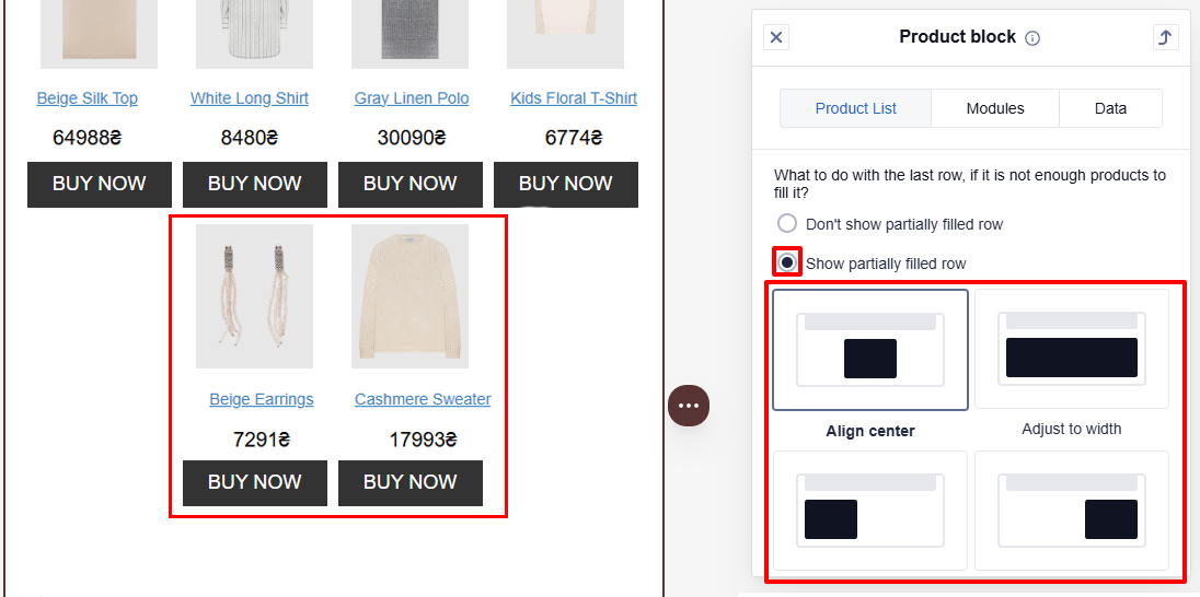
If there are not enough products to fill the last row (for vertical orientation)
Choose one of the options:
- Don't show partially filled row: If the last row of product cards contains fewer cards than the value you selected in the Number of products in a row section, then this row is not displayed for the recipient.
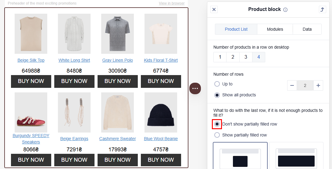
- Show partially filled row: The last row of product cards is displayed for the recipient, even if it contains fewer cards than the value you selected in the Number of products in a row section.
If you select Show partially filled row, set the alignment for the cards in the last row: center, left, right, or full width.
If there are no products to show
In this case, choose one of these options:
- Do not send the message: Default setting. The message will not be sent if there are no products to show.
- Hide product list: The message will be sent, but the content of the Products block will not be displayed for the recipient.
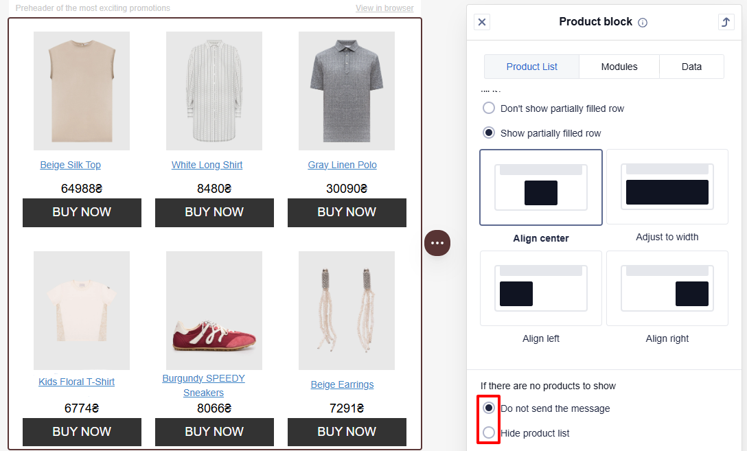
If the message contains multiple Products blocks, you can set separate conditions for each block.
For example, the first block shows items in the abandoned cart, and the second one shows recommendations based on the items in the cart. If you select the Hide product list option for the second block, it will not be displayed in the message if there are no recommendations. The header and the footer of this block will not be displayed as well.
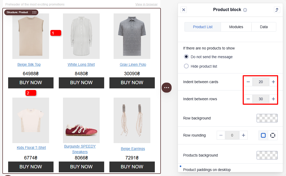
Indent options between cards and rows
Set the indent between the cards (1) and between the rows (2) in the block. Maximum value: 40 px.
Background and rounding
Select the products and row background color from the palette, or enter the hexadecimal code that corresponds to the desired color. By default, the background is transparent.
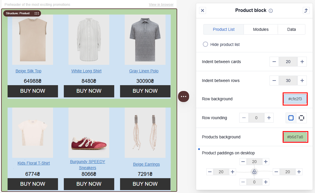
Enter the row rounding value for all rows. The maximum value is 50.
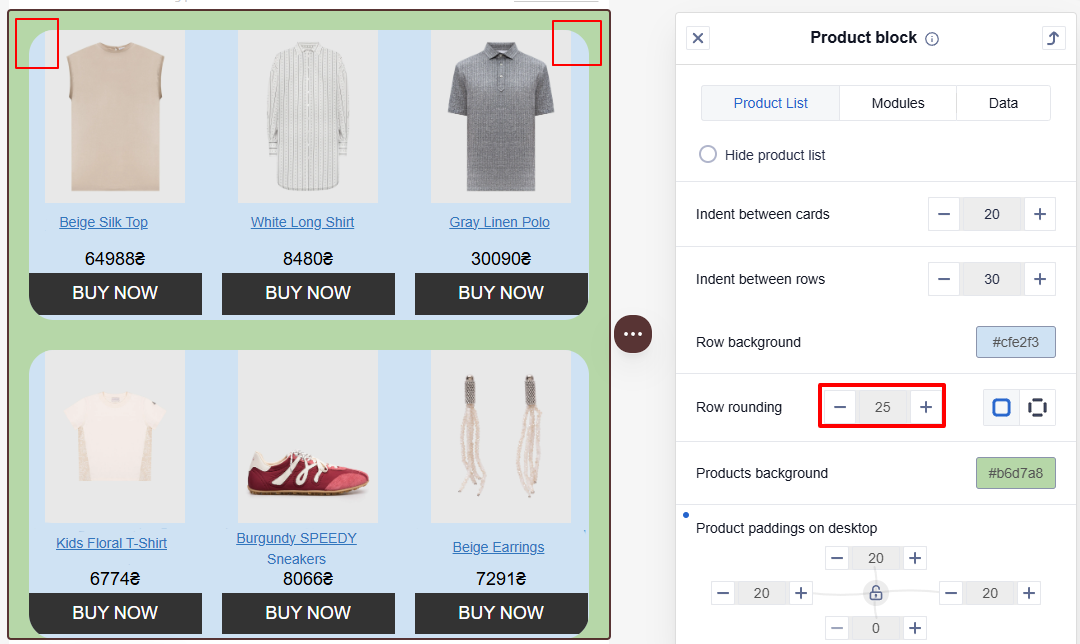
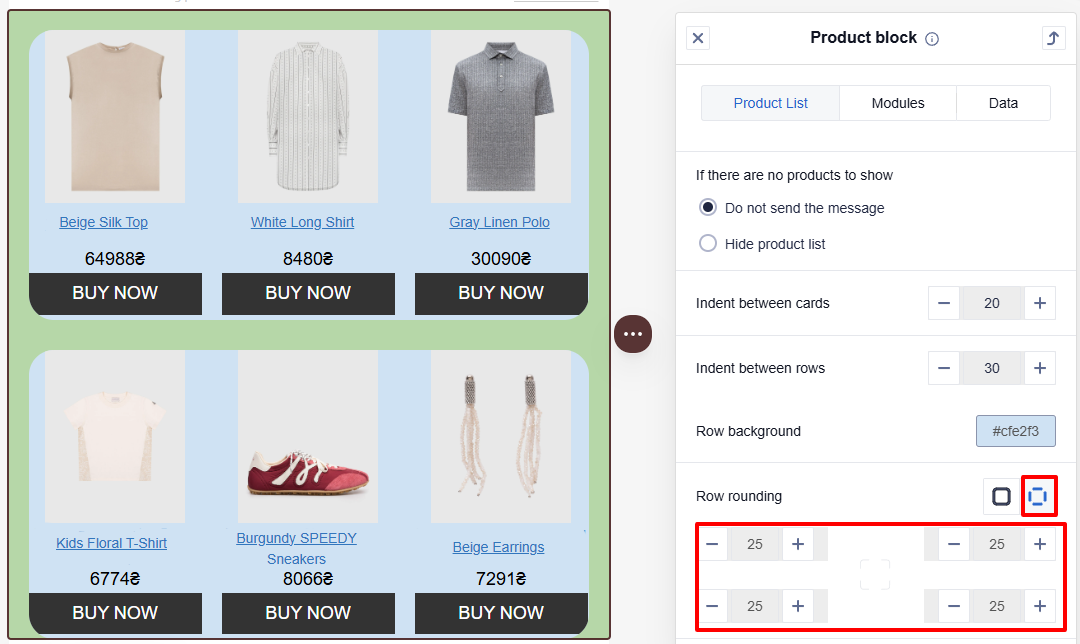
To select the rounding value for each corner separately:
- Click the Radius per corner button.
- Enter or select the required value for each corner. The maximum value is 50.
Products paddings
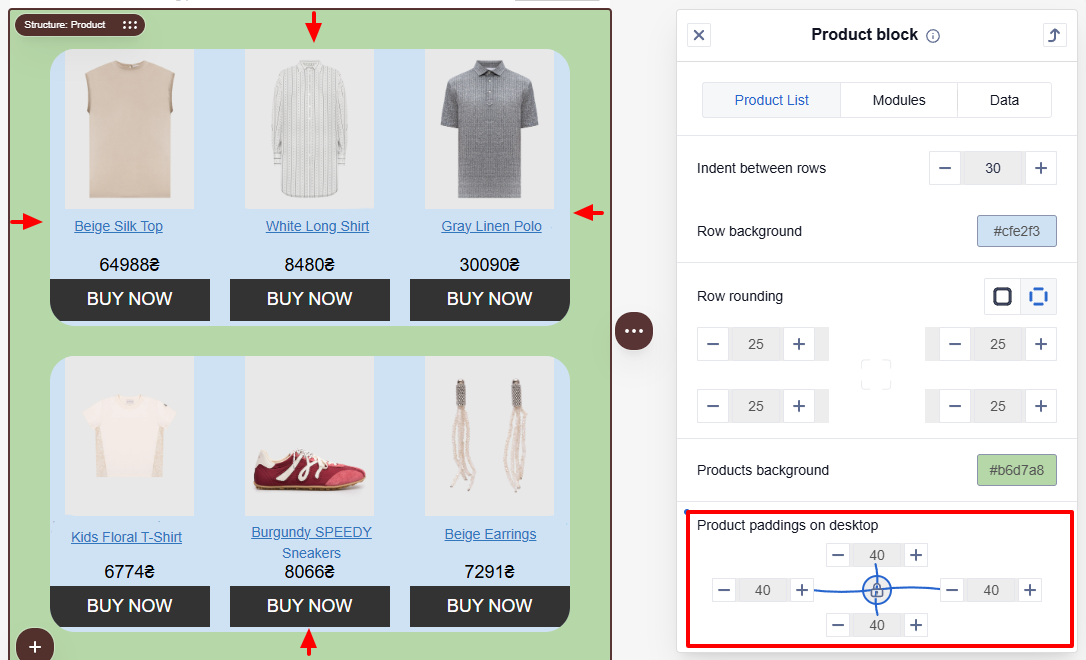
Paddings allows you to control the space around the product block. It helps separate the block from other elements in the email.
Apply the same values or set each side separately. To set spacing for all sides at once, click the lock icon.
Modules
Configure the display or replace headers, footers, and product cards.
The principle for changing elements in the tab is the same. For example, let's consider replacing Product cards.
- Click the Replace button.
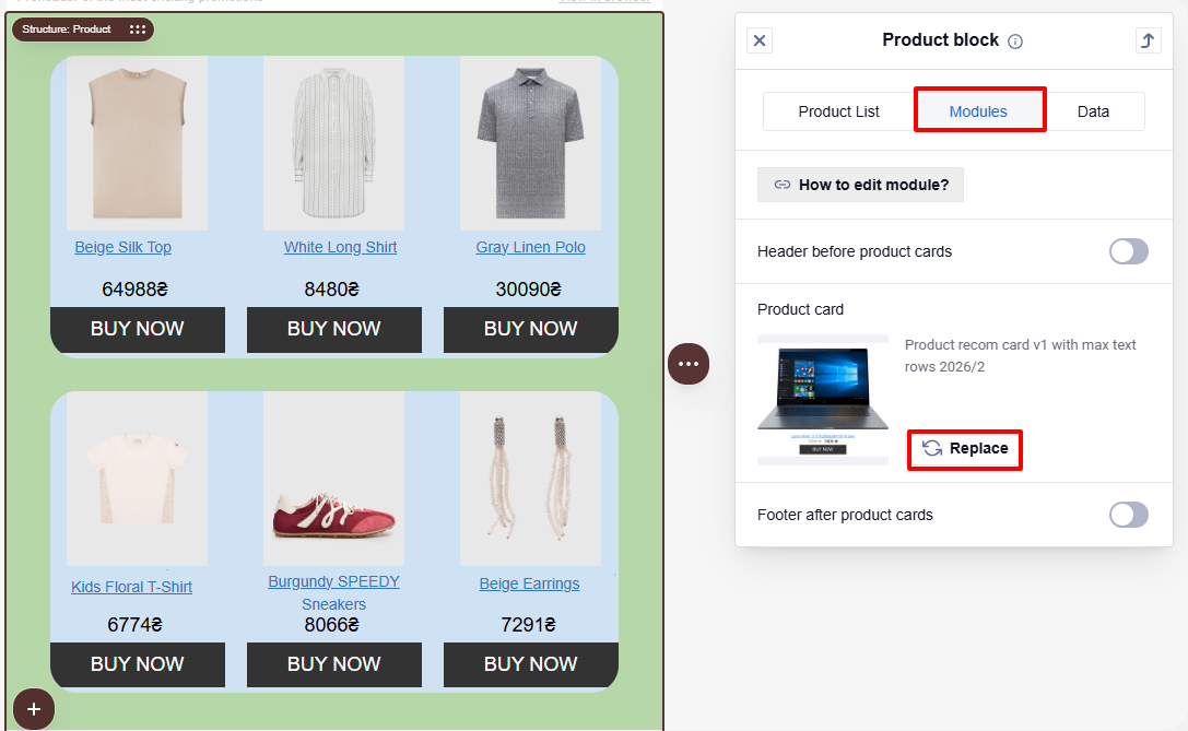
- Select a product card from the list or use the search field by name or tag.
In the All modules dropdown menu, you can filter modules by type:
- All modules
- Vertical modules
- Horizontal modules
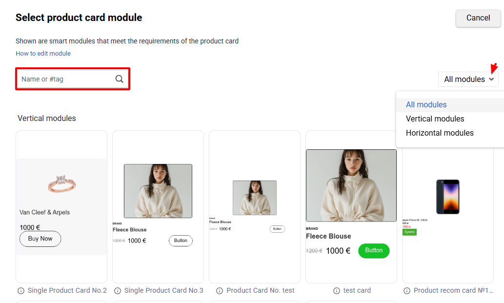
NoteThe selected module type (vertical or horizontal) automatically determines the card orientation in the product block.
Headers and footers are optional elements of the Products block, so they can be hidden by deactivating the corresponding switches.
Header before product cards is enabled by default.
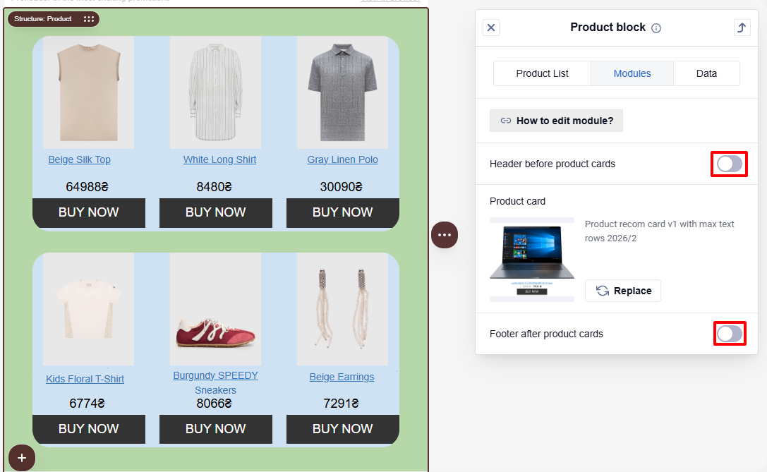
NoteThe header and footer will be hidden if there are no products to display in the block, even if their visibility is activated.
Learn more about configuring and creating modules >
Data
Select a data source and configure the automation for displaying products in the message.
The editor selects product data in the following order:
- Product data you uploaded.
- Sample products generated during Brand Kit setup when no product feed is available.
- Default sample products when neither of the previous sources is available.
Generated and default sample products are intended for creating and previewing email content. Set up a product feed before sending a campaign. If you send a test email without a feed, the Products block is skipped and the rest of the email is sent.
There are two types of data sources for the Products block:
- Recommendations based on contact data
- General recommendation algorithms
The Bestseller type algorithm is set in the Products block by default. If there is no Bestseller type algorithm, any of the general recommendation algorithms will be applied. If no general recommendation algorithms are available, then the algorithms based on contact data recommendations are set.
To replace the data source, click the Replace button and select the necessary one.
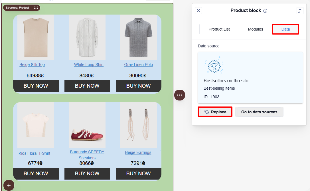
NoteWhen you change the data source, the changes are not applied in the editor. To view the actual message, select the View message icon on the top panel.

Click the Go to data sources button to create a new one.
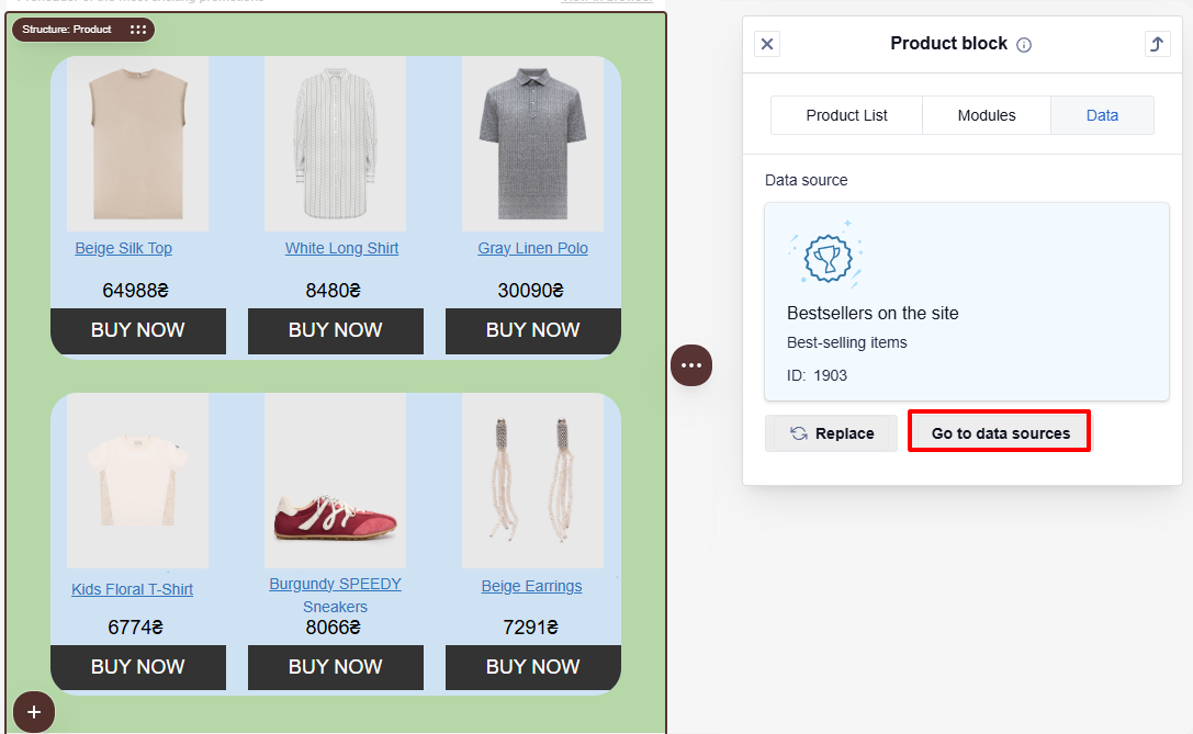
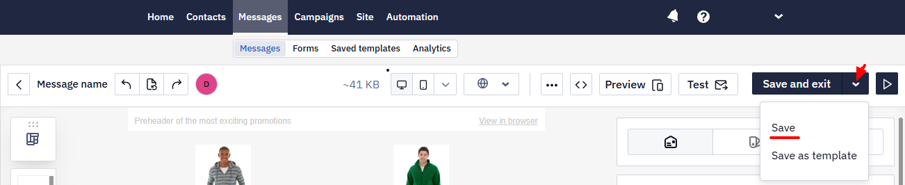
Click the Save button on the editor's top panel to save the email changes.
Note
- To display the product's old and new costs in the cards, we recommend using the additional Price component, which synchronizes the price data from the site with the data in the email.
- This instruction describes editing and saving product cards of blocks in the module library.
Updated 2 months ago