Setting Up Responsive Email Design
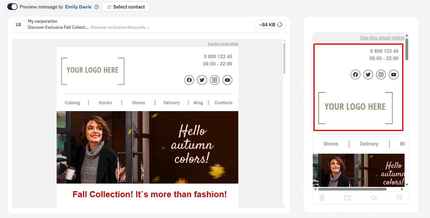
Responsive design ensures that the email is displayed correctly on both mobile and desktop devices.
With responsive design, you can:
- restructure the email layout;
- change the order of containers;
- hide individual elements.
NoteOnly email clients that support responsive layout will render these adaptations.
General Responsive Settings
The General styles panel contains all email design parameters. It allows you to quickly apply a consistent style to the entire message and all its elements.
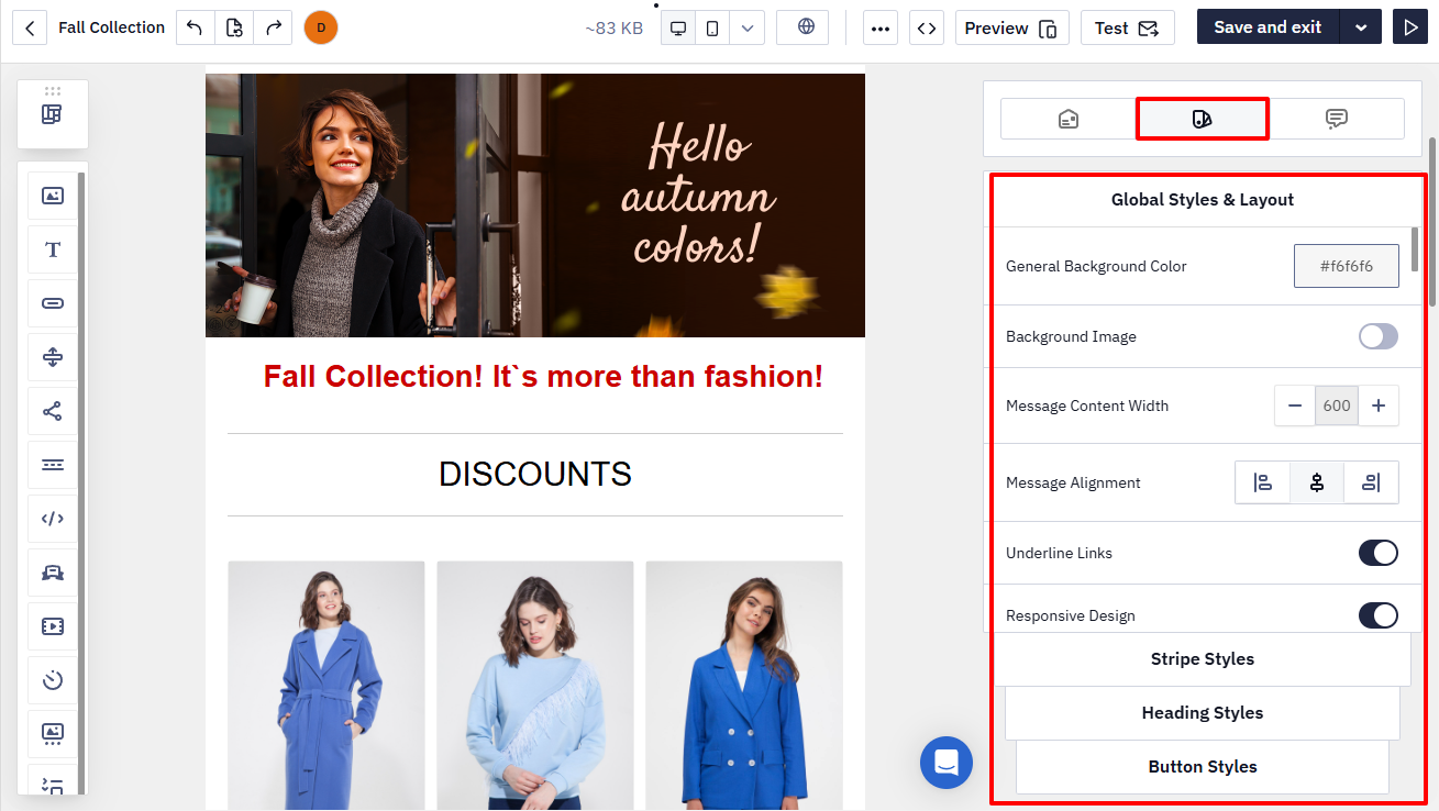
The Responsive design option is enabled by default.
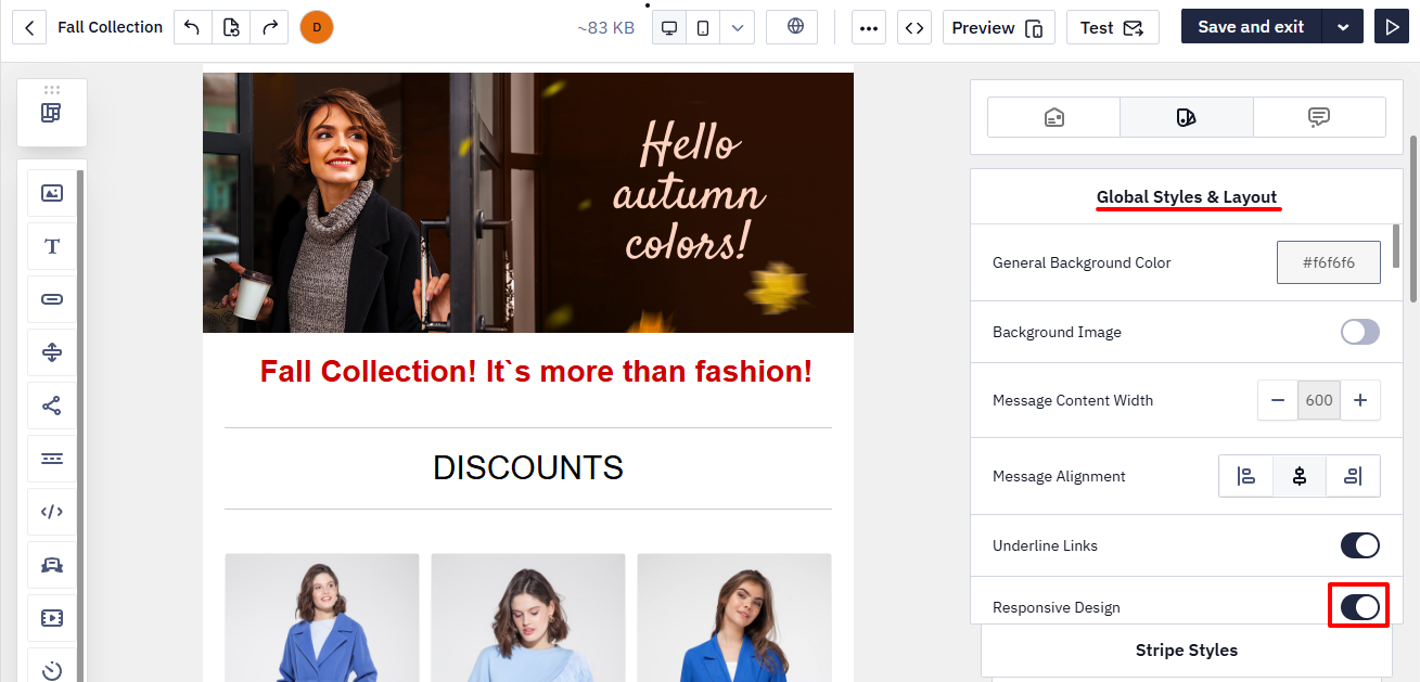
If you disable this option, the email will not adapt to mobile devices.
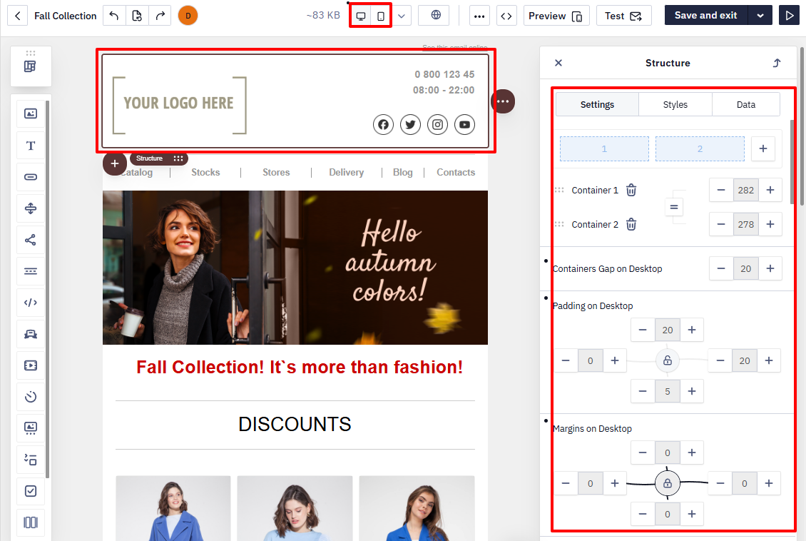
Responsive Settings for Individual Elements
Each stripe, structure, container, and block has its own responsive settings.
To change them:
- Click the required element in the template.
- Open the settings panel.
- Adjust the parameters for the mobile and/or desktop version.
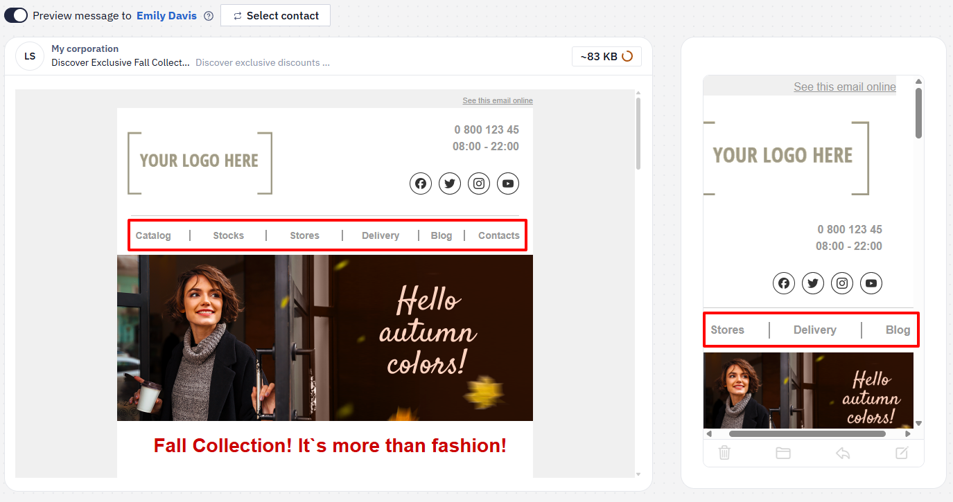
Hiding an Element
Any email element can be hidden when displayed on a mobile or desktop screen.
For example, you can shorten the Menu block in the mobile version by hiding some of its items.
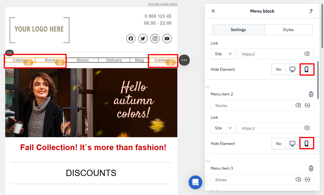
As a result, the element will not appear in the selected version.
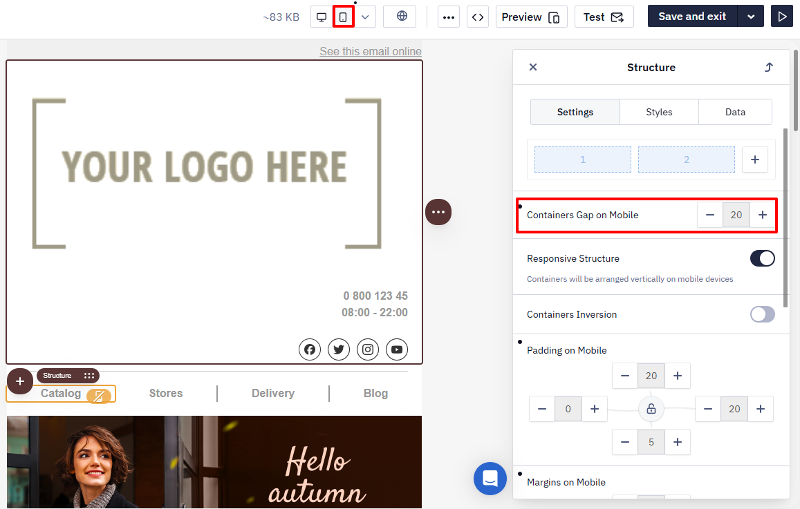
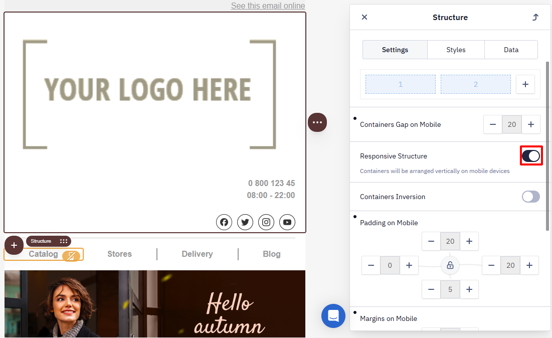
Containers Gap on Mobile
On mobile devices, screen width is limited. Adjusting spacing helps prevent elements from being placed too closely together and improves usability.
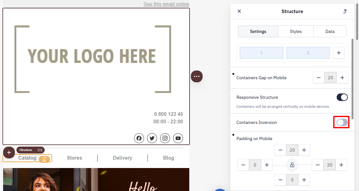
Containers Inversion on Mobile
The inversion option changes the display order of containers in the mobile version.
Example
On desktop, the image is on the left and the text is on the right.
After inversion, the text appears first on mobile, and the image is displayed below it.
Use inversion when you need to change the reading order of content on mobile devices.
Responsive Structure
The Responsive Structure option is enabled by default. It rearranges containers so that on mobile devices they are displayed one below another (in a single column).
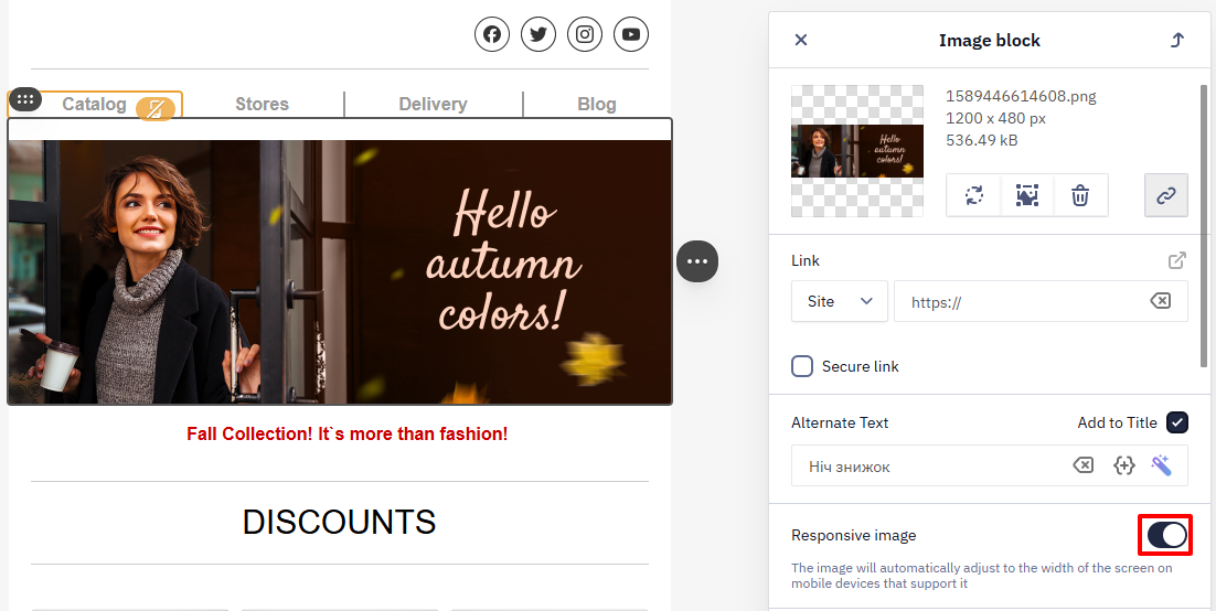
Responsive Image
The Responsive Image option adjusts the image width to fit the mobile screen:
- the image does not extend beyond the screen width;
- the proportions are preserved.
Text Alignment and Spacing
Separate alignment and spacing parameters for:
- the desktop version;
- the mobile version.
Updated 30 days ago