
Creating In-App Message
In-App messages are messages that are displayed to the user while they are using a mobile app. You can define the content of the message and the rules for its display to target the message to a specific audience.
ImportantTo send In-App messages from our platform, you need to Install SDK.
To create a new message:
-
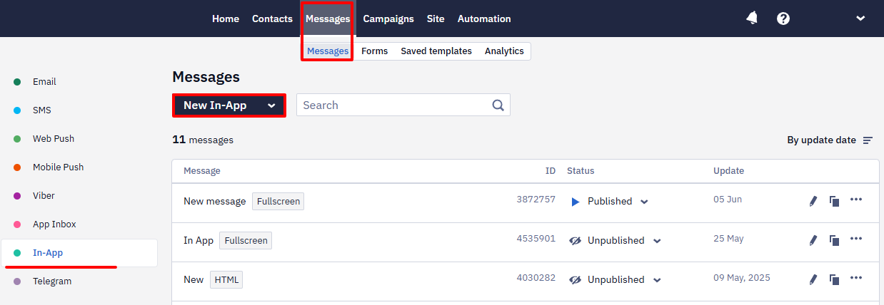
Go to the Messages → Messages → In-App section. Click the New In-App button.
-
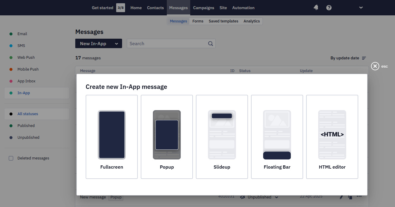
Select the message type:
- Fullscreen
- blocks app content
- closes by pressing the cross icon
- Popup
- blocks app content
- closes when tapping outside the message or by pressing the cross icon
- Slideup
- has top or bottom positioning
- does not block app content
- closes by swiping left/right and up/down depending on the positioning or by clicking on the cross icon
- Floating Bar
- has bottom positioning
- does not block app content
- closes with a swipe left/right/down or by pressing the cross icon
All of the above message types are created in a drag-and-drop editor. You can also use the HTML editor to get more options for customizing the message content.
All In-App message types appear on top of the app screen, so a message can't be embedded into the screen itself as a permanent banner. On a website, you can create a permanent banner with an Inline widget.
Working in the Drag-and-drop Editor
Let's look at creating a full-screen message - the functionality of other In-App types is identical.
The components for building the message are located in the left-hand side panel. To add a component, drag and drop it to the editor field.
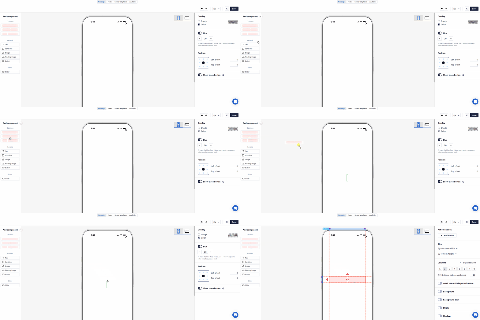
Columns and Container can contain other components, except for the Floating image component.
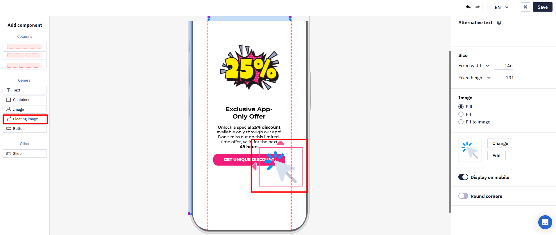
Floating image overlays other components. It can be used, for example, to emphasize a specific element.
The right-hand side panel of the editor contains a menu with editing options for each component. Click the relevant component to display its menu.
To return to the main layer menu of the editor, click anywhere outside the components.
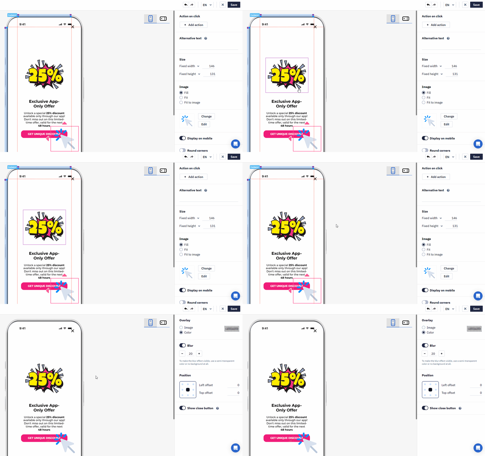
Duplicating and Managing Pages
You can add up to 20 pages to an In-App message.
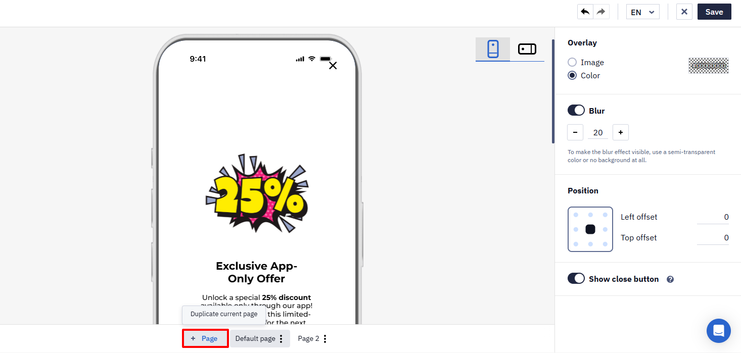
To duplicate the current page, click + Page, or open the page menu and select Duplicate selected page.
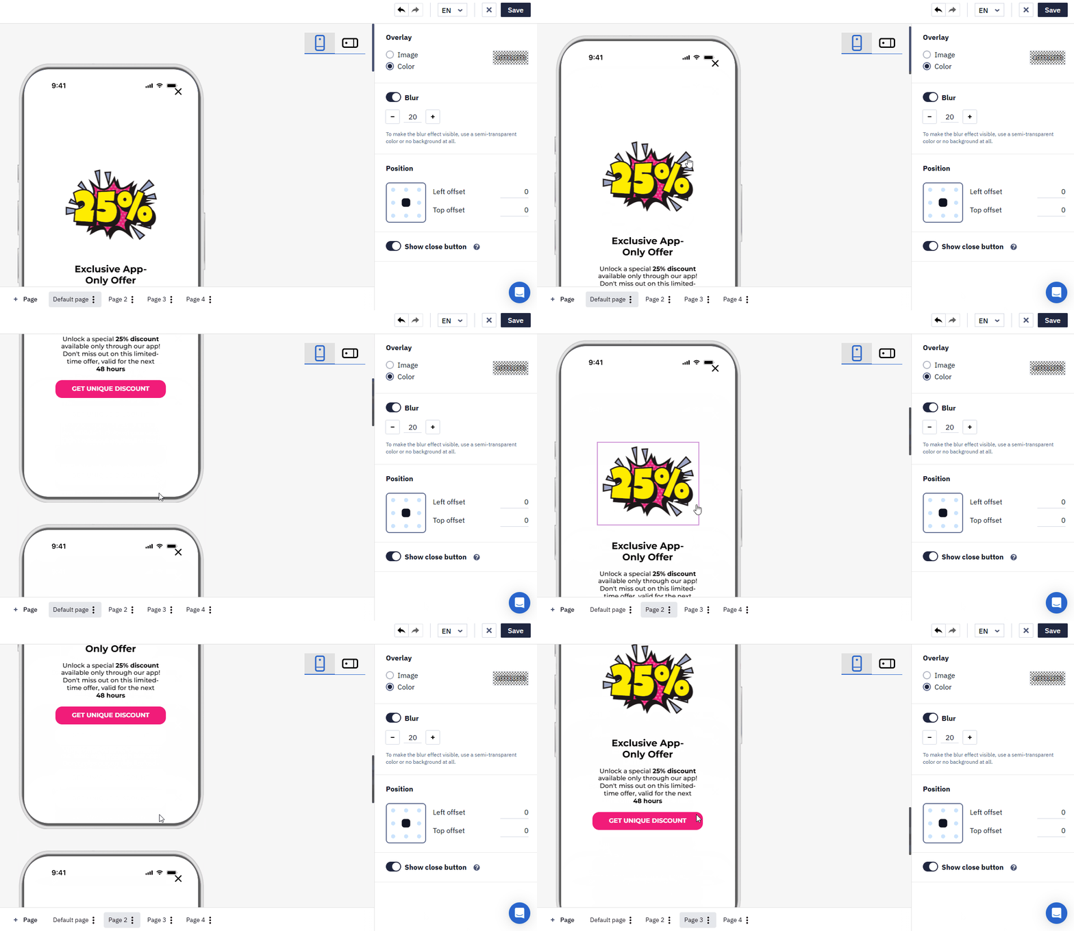
The duplicated page is added immediately after the selected page.
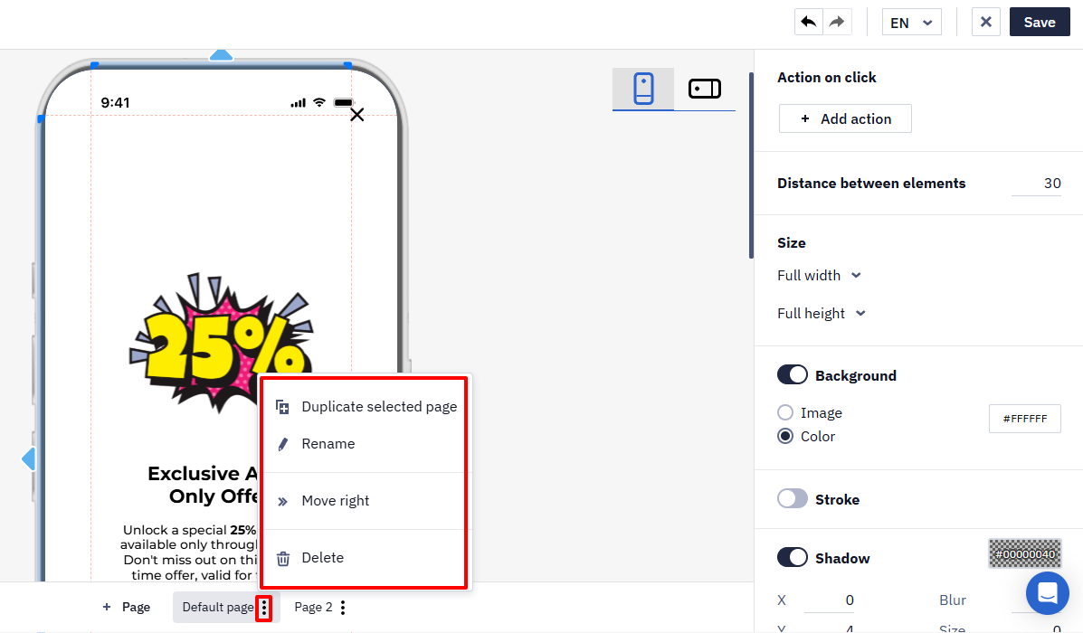
From the page menu, you can also rename, move, or delete the selected page.
The following settings are available for the components.
Action on click
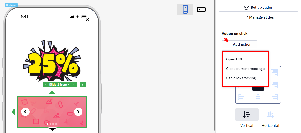
Expand the +Add Action menu and choose the action to be performed when clicking on the element:
- Next page
- Previous page
- Open URL
- Use click tracking
- Close the current message
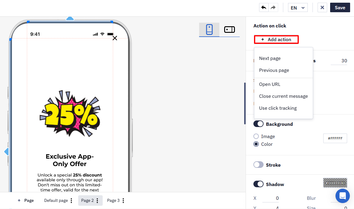
Next page and Previous page appear when the message has more than one page.
You can add one or several actions.
A click is counted in the statistics if the element has the Open URL or Use click tracking action. A click on an element that only has the Close the current message action isn't counted as a click.
NoteEach button in an In-App message can have its own link, deep link, or custom data, so clicks on different buttons are distinguished by these values when you handle them in the app or analyze click data. After the user clicks a button, the In-App message closes.
A button can open a link, open a deep link, or pass custom data — it can't generate an event on its own. Attaching an event to a link is available in email only: In-App links aren't stored the way email links are, so an event can't be bound to them. To act on a button press, use click tracking or take the visitor to a page that generates the event.
Setting Up Page Navigation
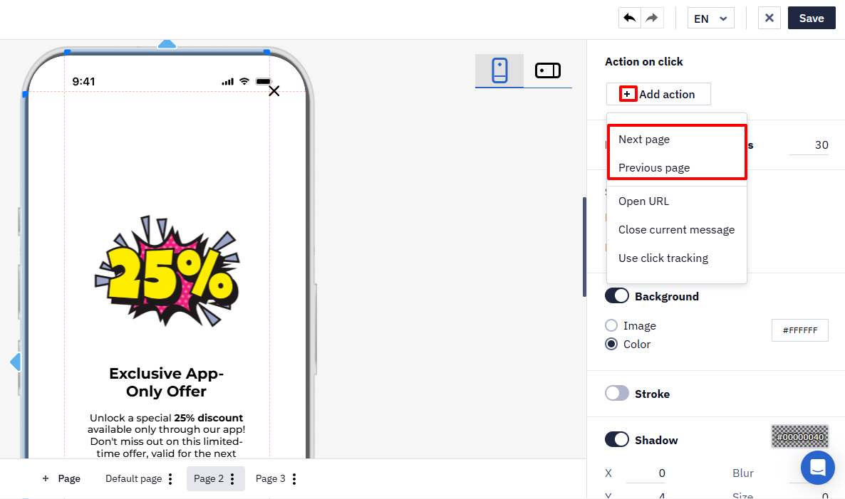
To set up navigation between pages:
- Select a button, an image, or the entire In-App page.
- Open the Action on click settings.
- Select the Next page or Previous page action.
Align Inner Elements
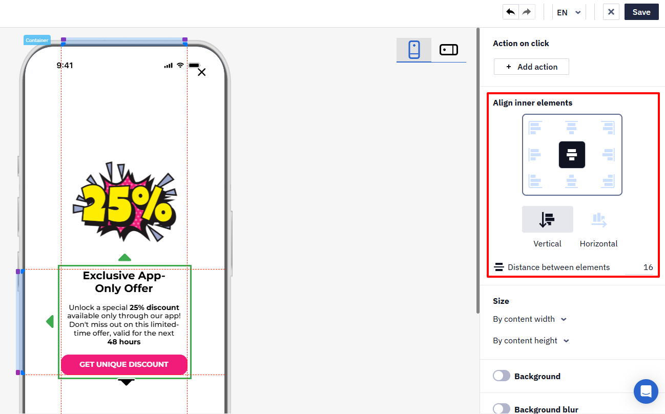
Select the appropriate icon for aligning elements within the container or columns.
Enter the value for the distance between elements in the corresponding field. The minimum value is 0.
Size
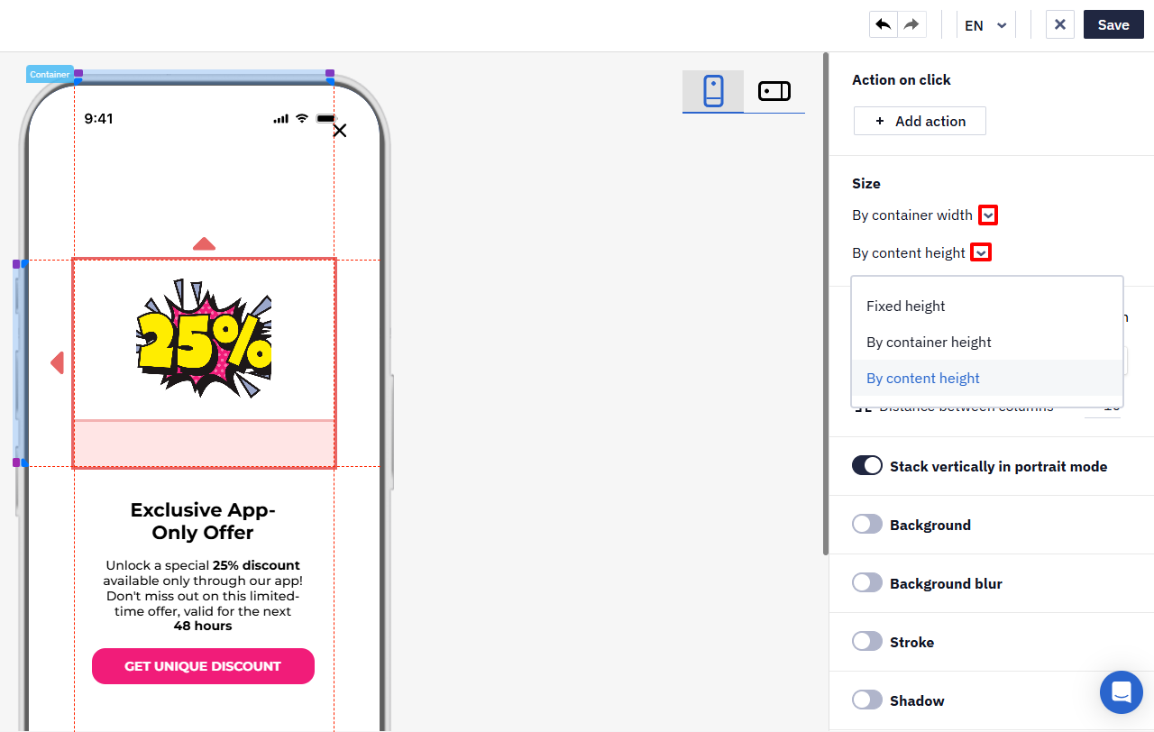
Expand the drop-down lists and select the necessary sizes from the following options.
For width:
- Fixed width. The minimum value is 20.
- By container width.
- By content width.
For height:
- Fixed height. The minimum value is 20.
- By container height.
- By content height.
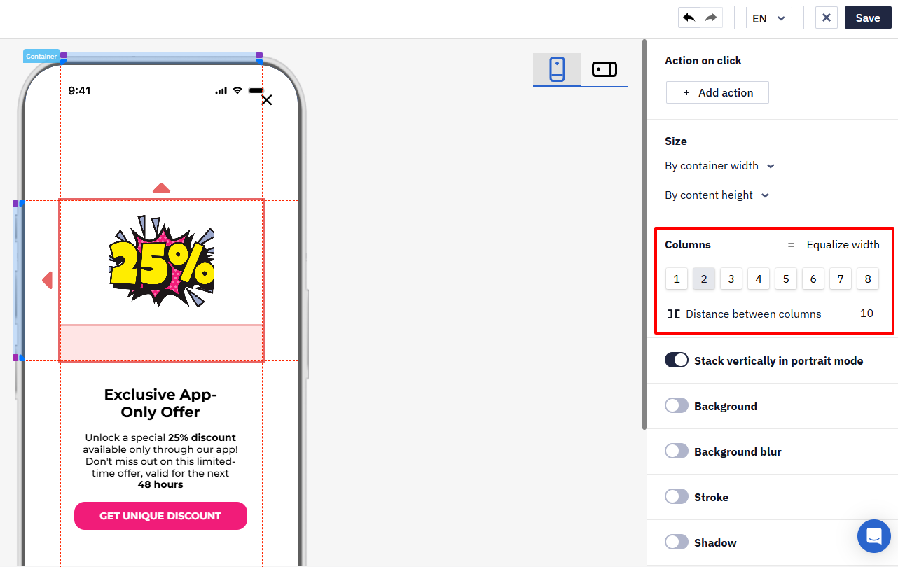
Columns
For the Columns component, you can choose the following settings:
- Equalize width. This option sets equal width for all columns.
- Number of columns. Select the number of columns from 1 to 8.
- Spacing between columns. Enter a number in the field to set the distance between columns in pixels. The range is from 0 to 40.
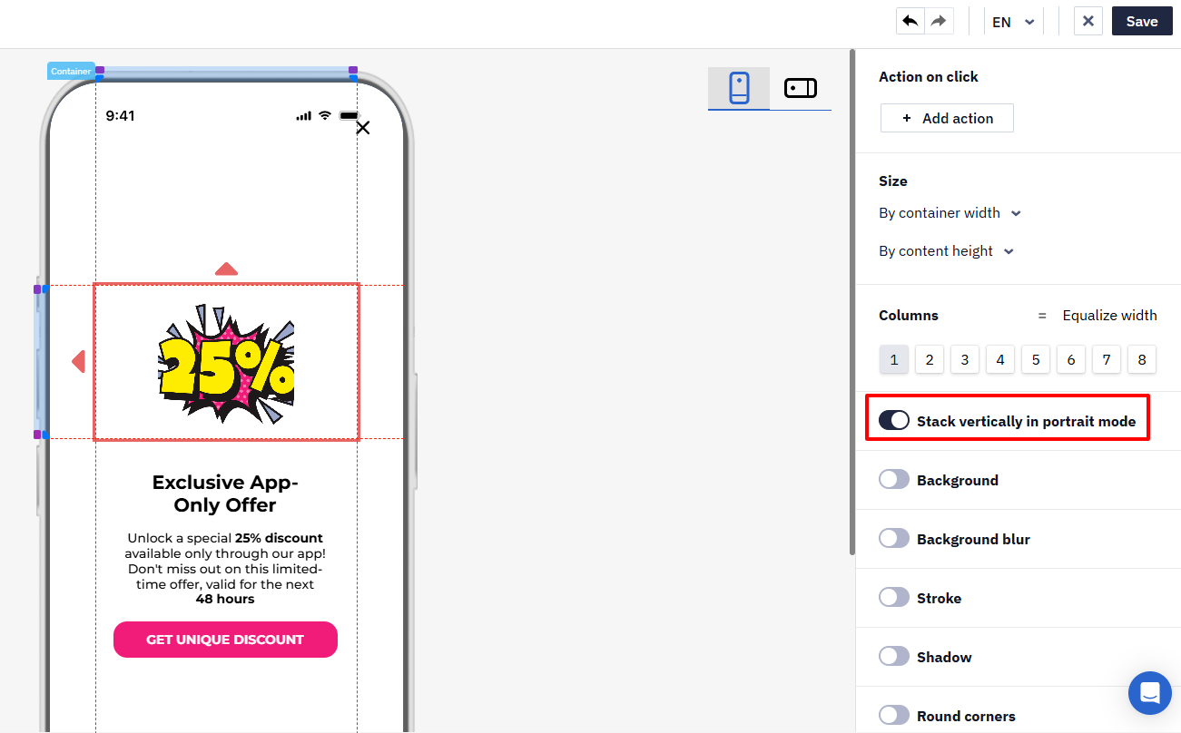
Stack Vertically in Portrait Mode
When this option is enabled, the columns are displayed vertically when the message is viewed in portrait mode.
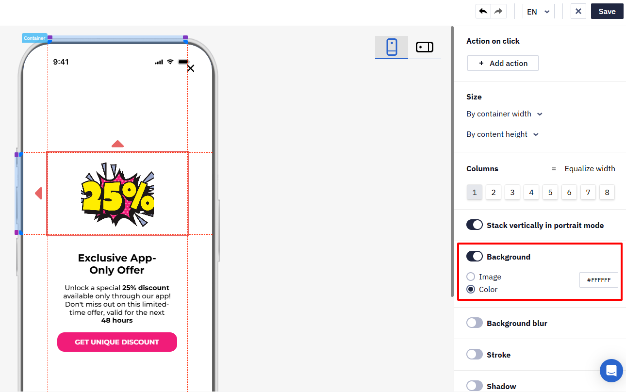
Background
To select the background of the component, activate the Background slide button and choose one of the following options:
- Image to upload your pictures or select from the built-in library.
- Color to choose the desired color from the palette or enter its code manually.
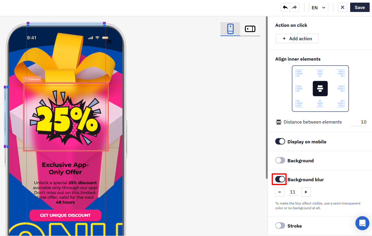
Background Blur
The acceptable values for background blur range from 0 to 100.
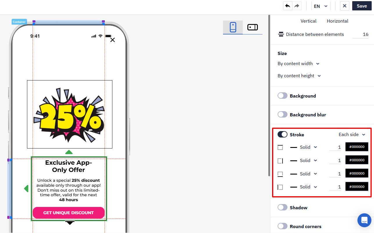
Stroke
Activate Stroke to set formatting for the outer contour of the Container and Columns components. You can set the same stroke format for all sides at once or for each individually by choosing:
- Stroke Type: solid, dashed, dotted.
- Thickness: Acceptable values are from 0 to 100.
- Color: Choose it from the palette or specify manually.
Shadow
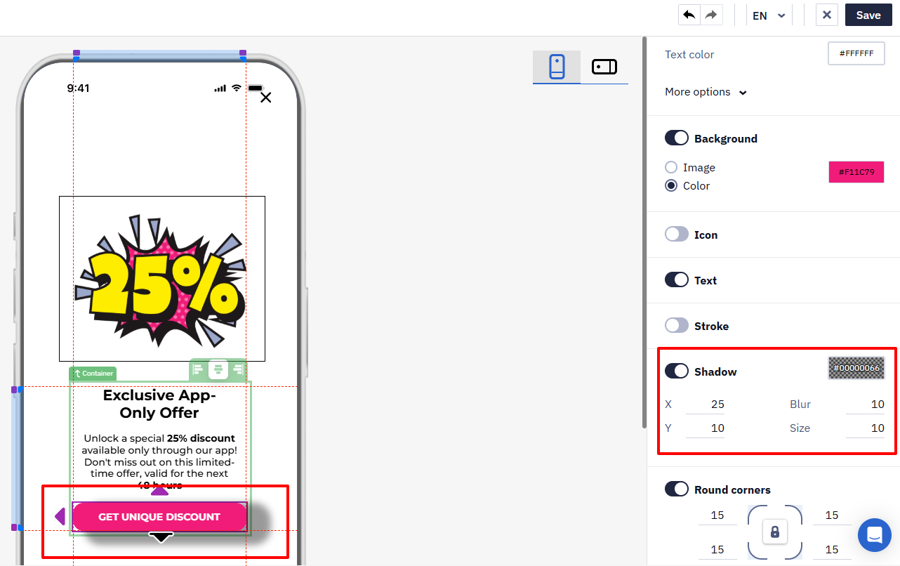
Activate the slide button to set shadows for the component. The following settings are available:
- Vertical (x) and horizontal (y) spread.
- Blur.
- Size.
- Color.
Hover over each value field to see its minimum and maximum value.
Round Corners
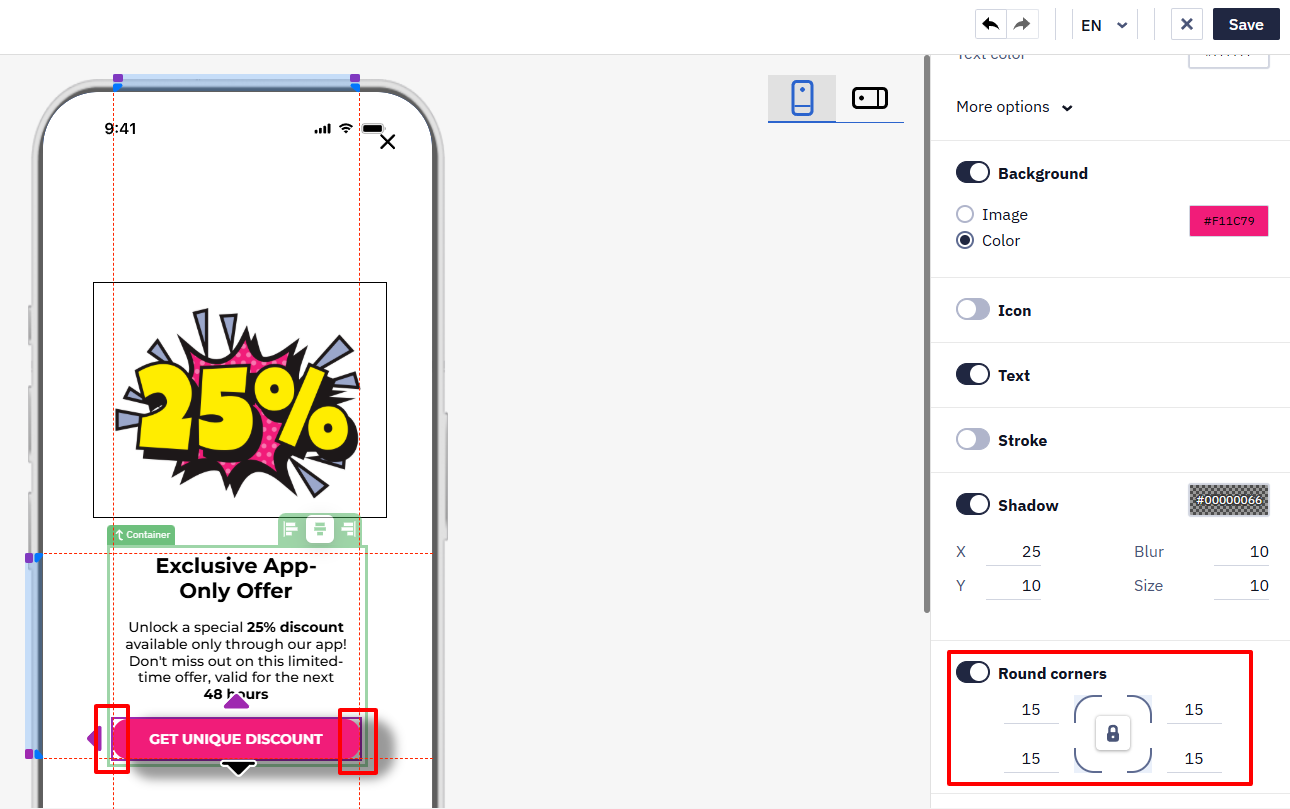
This option allows you to set the value for rounding the component's corners.
Text Formatting
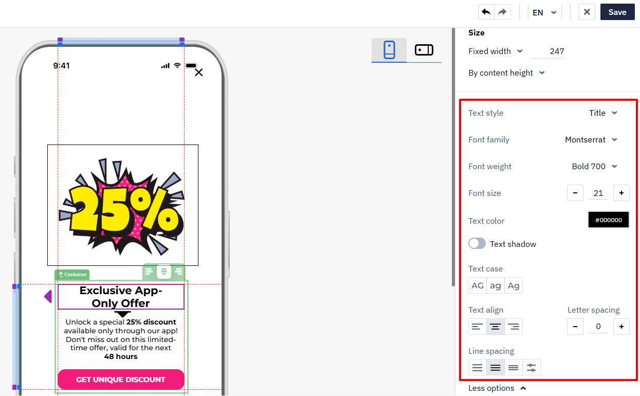
Select the component that contains text to access the formatting menu.
Custom Fonts
In the text formatting menu, open the Font field and switch to the My fonts tab to add and use your own fonts, matching your brand style without switching to the HTML editor.
Click + Add font and fill in the font parameters:
- Font name
- URL with CSS file
- Family
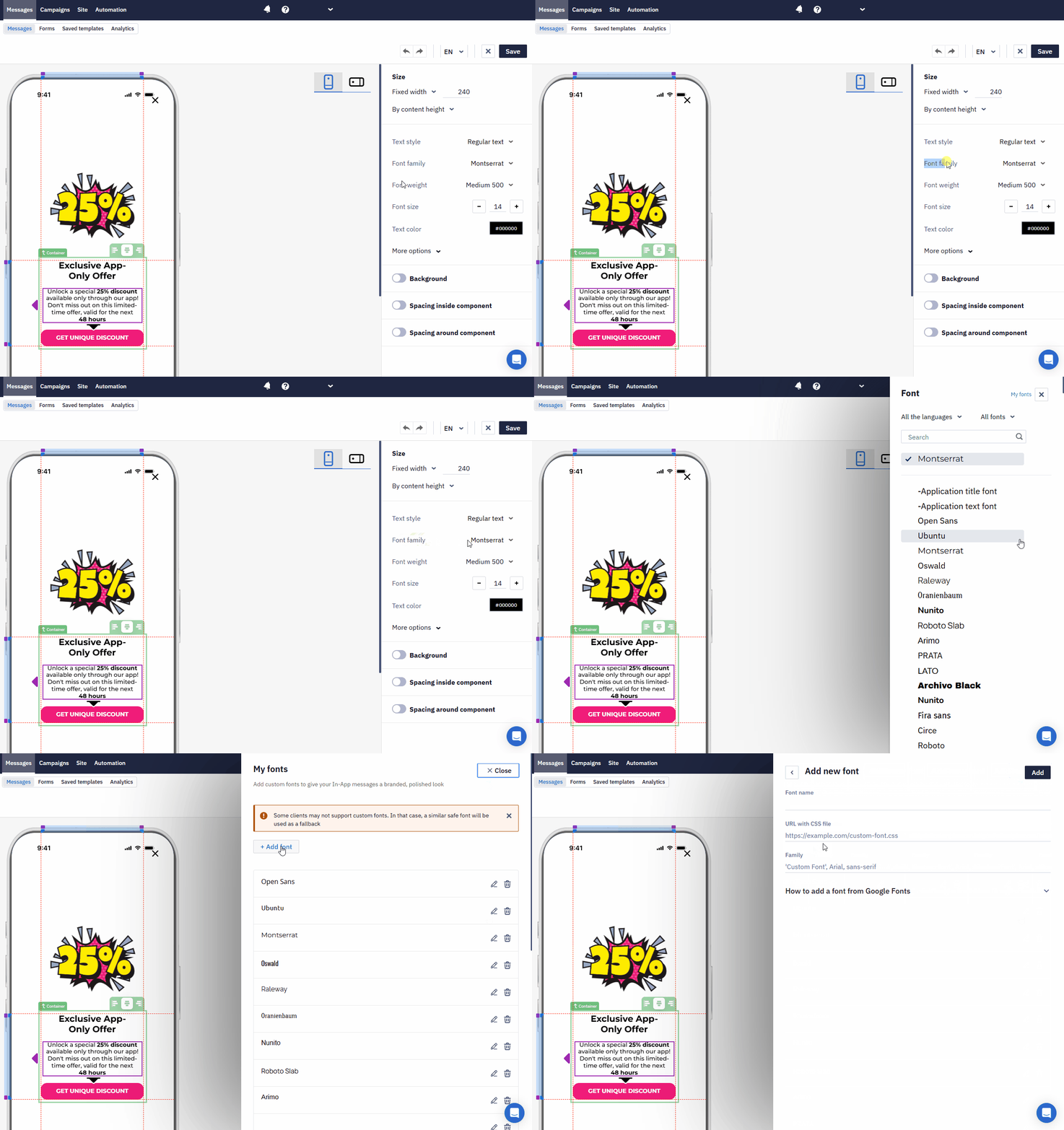
You can get these parameters from Google Fonts or another font library — the process is the same as for the Email editor.
Once added, the font appears in the My fonts list, where you can edit or delete it, and becomes available for selection in the Font field for any text component.
NoteSome email and app clients may not support custom fonts or fail to load them. In that case, a similar system font is used as a fallback.
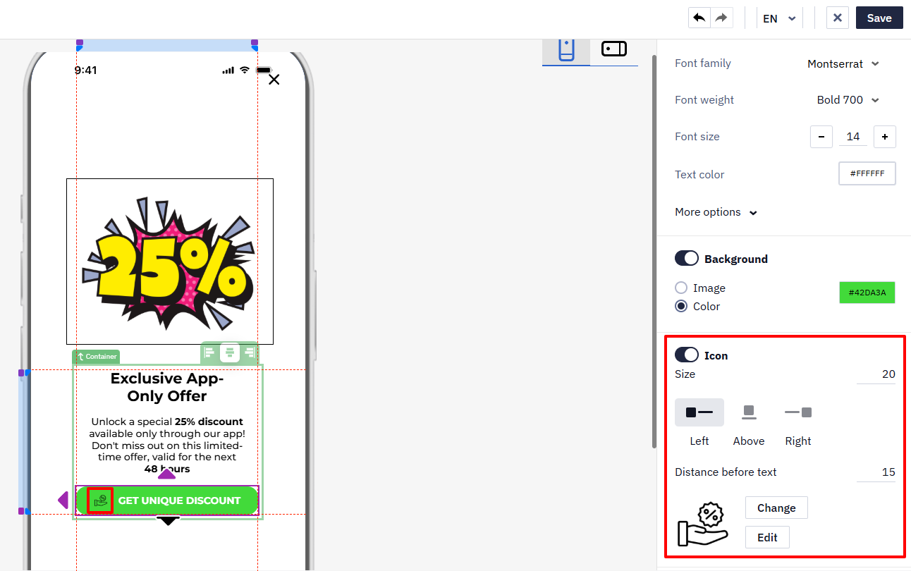
Icon
For the Button component, you can add an icon with the following parameters:
- Size
- Alignment
- Distance before text
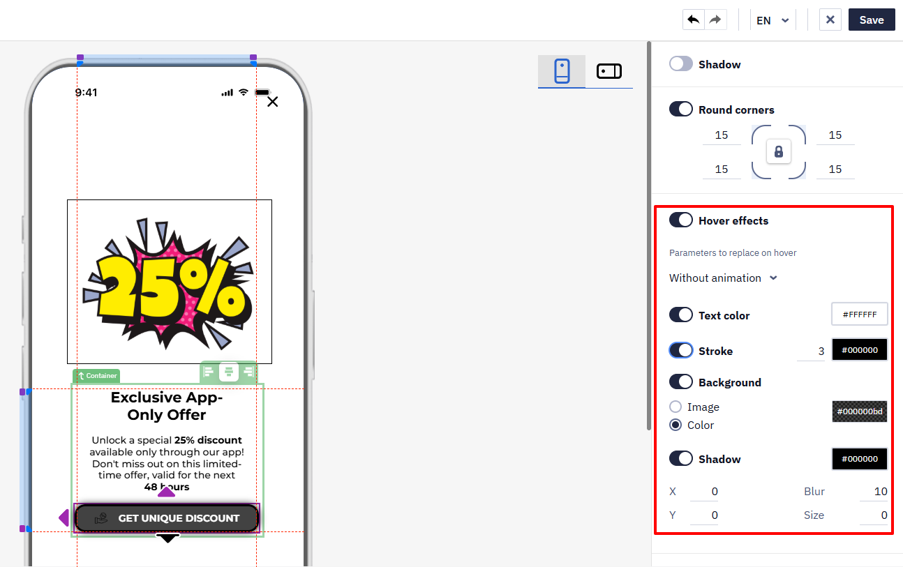
Hover Effects
Activate the slide button to make the button more interactive when hovered over or tapped.
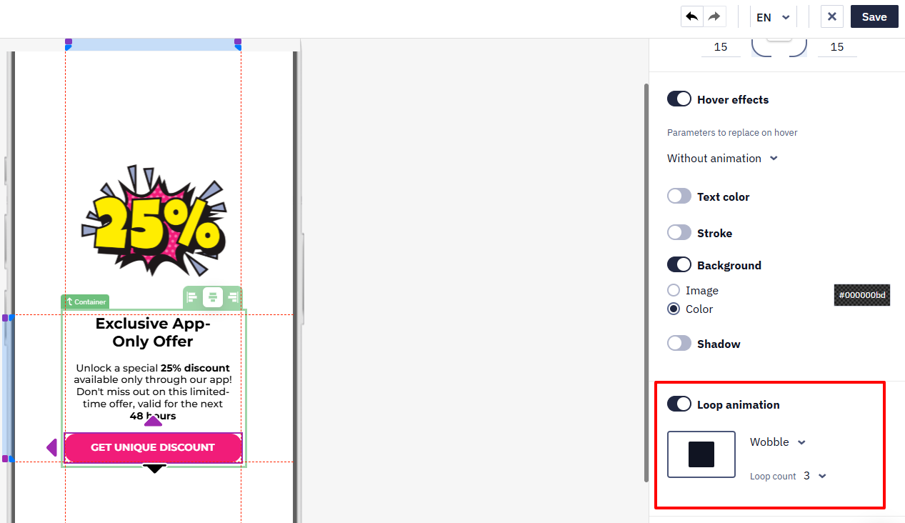
Loop Animation
The Loop animation option allows you to choose the following parameters for the Button component from the drop-down lists:
- Animation type.
- Number of repetitions.
Slider
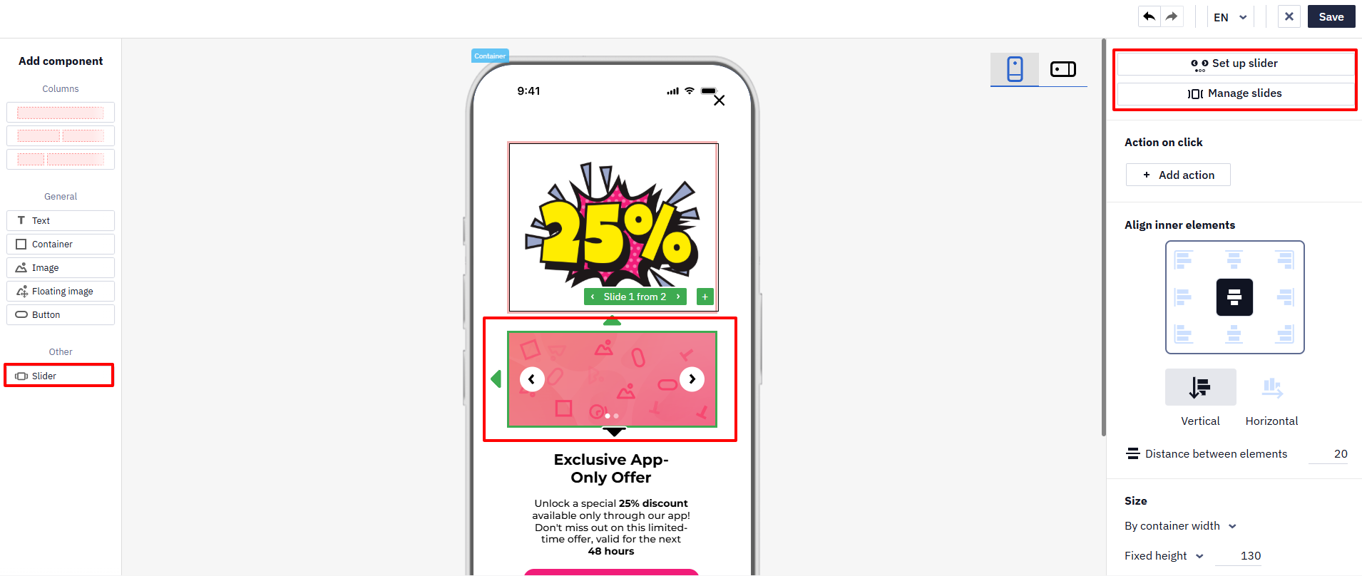
Drag the slider from the left-side panel and drop it into the message template. Set up slider and Manage slides buttons will appear on the right-side panel.
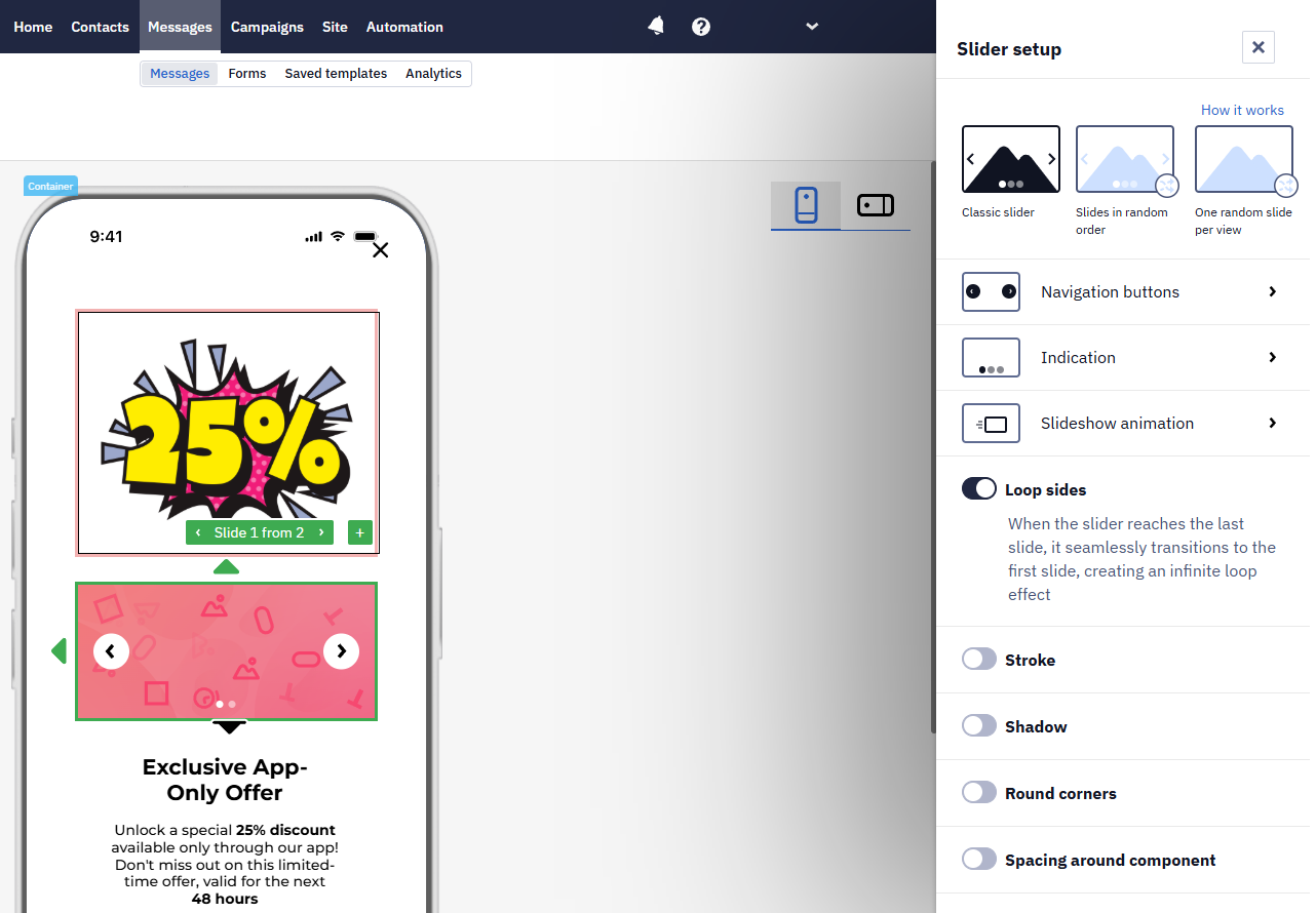
In the slider setup window, you can set up navigation buttons, indications, slideshow animation, and the slider's general design.
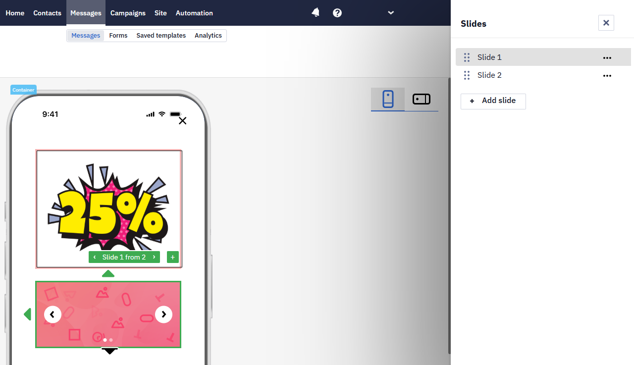
Manage slides’ order, add, duplicate, or rename slides after clicking the Manage slides button.
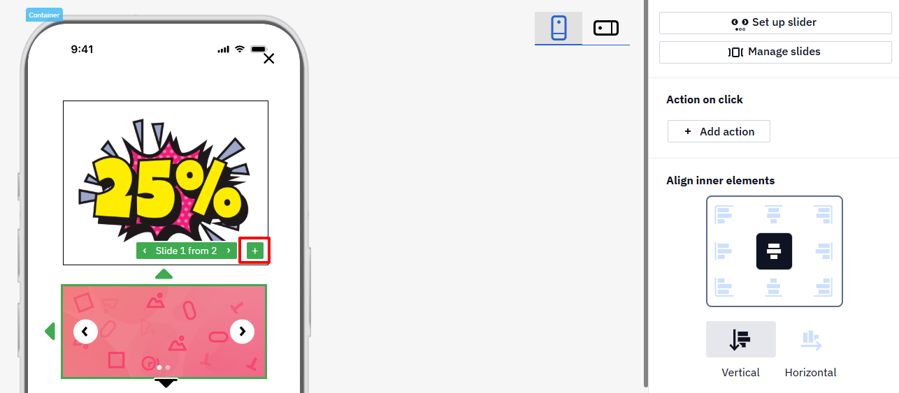
Also, you can add a slide by clicking on the + sign.
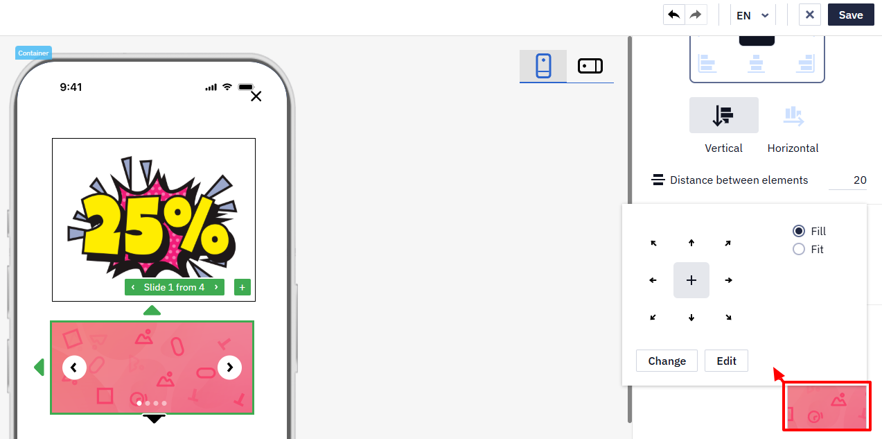
To change or edit an image, click on it in the template, after which it will appear in the right settings panel. Clicking on the image from the slider in the settings panel opens the editing window.
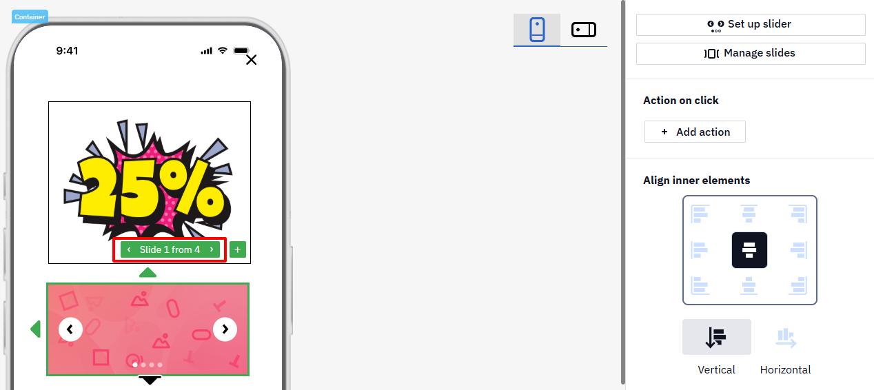
Use navigation buttons to switch between the slider’s images.
Set the action on click:
Countdown Timer
The component shows the time left until a specified date. Drag Countdown timer from the left-hand panel into the message — the Time settings window opens right away:
- Format — the units the timer shows, for example
HH:MM:SS. - Mode — Until the expiration date: the timer counts down to the date and time you specify.
- End time — the moment the timer stops. The end date of the timer matches the end of the message publishing period.
- Timezone — User timezone by default.
Click Done to add the timer. To change these parameters later, use the Setup time button in the right-hand panel.
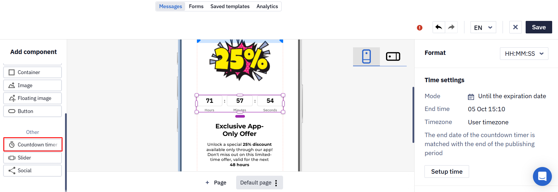
The Show titles toggle turns on the captions under the digits. The language of the Days, Hours, Minutes, and Seconds captions follows the user's language, not the language version of the message.
The remaining settings — size, text style, background, stroke, shadow, round corners, and margins — are the same as for the other components.
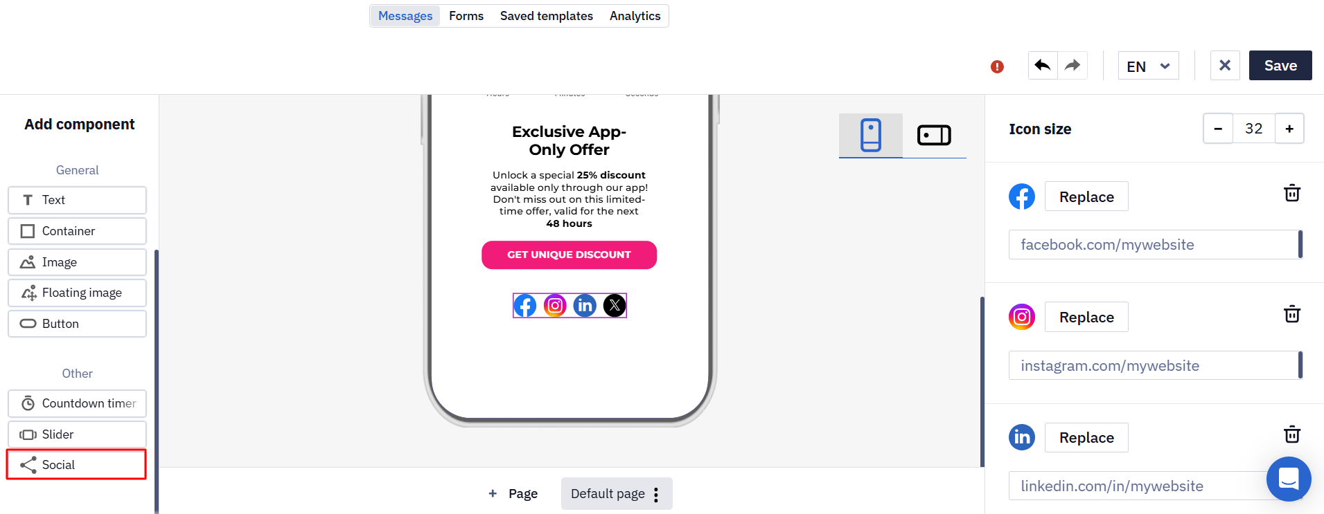
Social
The component adds a row of icons linking to your pages. Four platforms are included by default: Facebook, Instagram, LinkedIn, and X.
- Enter the link to your page for each platform.
- Icon size sets the size of all icons in the row.
- Replace uploads your own image instead of the default icon, and the bin icon removes the platform from the row.
- + Add platform adds one more position: upload an icon for it and specify the link.
Context Menu
A Context menu becomes available upon right-clicking on the message component with the following actions:
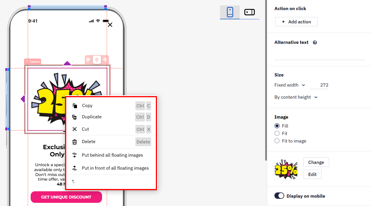
- Copy
- Duplicate
- Cut
- Delete
- Put behind all floating images
- Put in front all floating images
- To container
Close Icon
The Close icon allows the user to close the message.
You can use standard and custom icons with settings for color, size, and positioning on the screen.
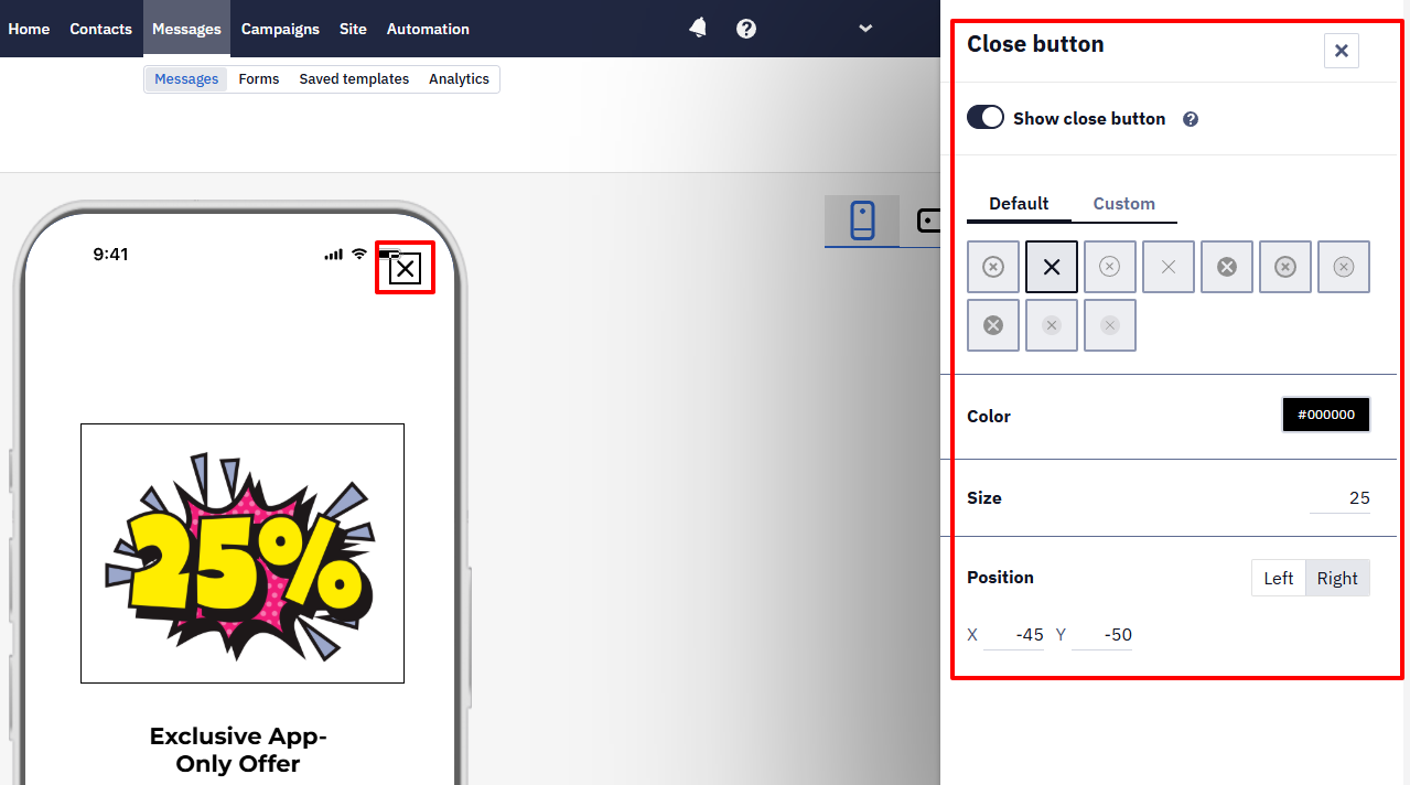
NoteThe position of the Close icon is calculated from the top-right or top-left corner of the message.
Message Orientation
The message can be displayed in Portrait or Landscape mode, depending on how the user holds the device (vertically or horizontally).
Both orientations share a single set of components: you can't hide a block in only one of them or give an image a different size per orientation. The exception is Stack Vertically in Portrait Mode, which changes only how columns are arranged in portrait. Build the layout so that it works in both.
To see how the message will display on the device, click the Orientation icon at the editor's top.
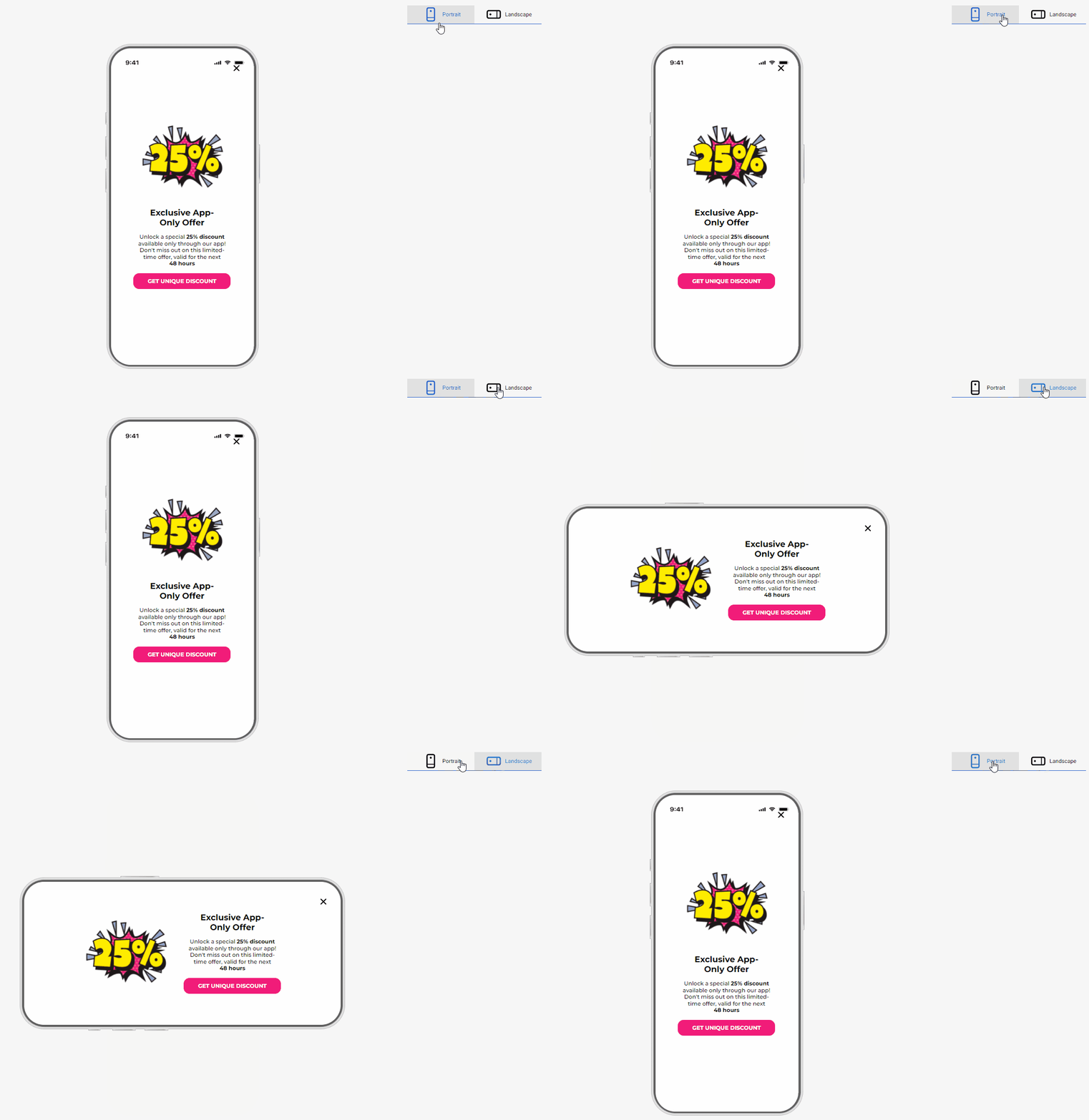
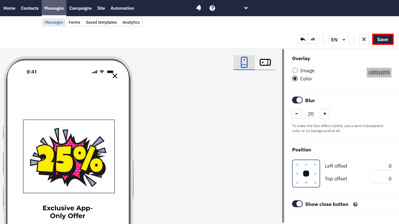
Press the Save button on the top panel of the editor to apply the changes after configuring the In-App message.
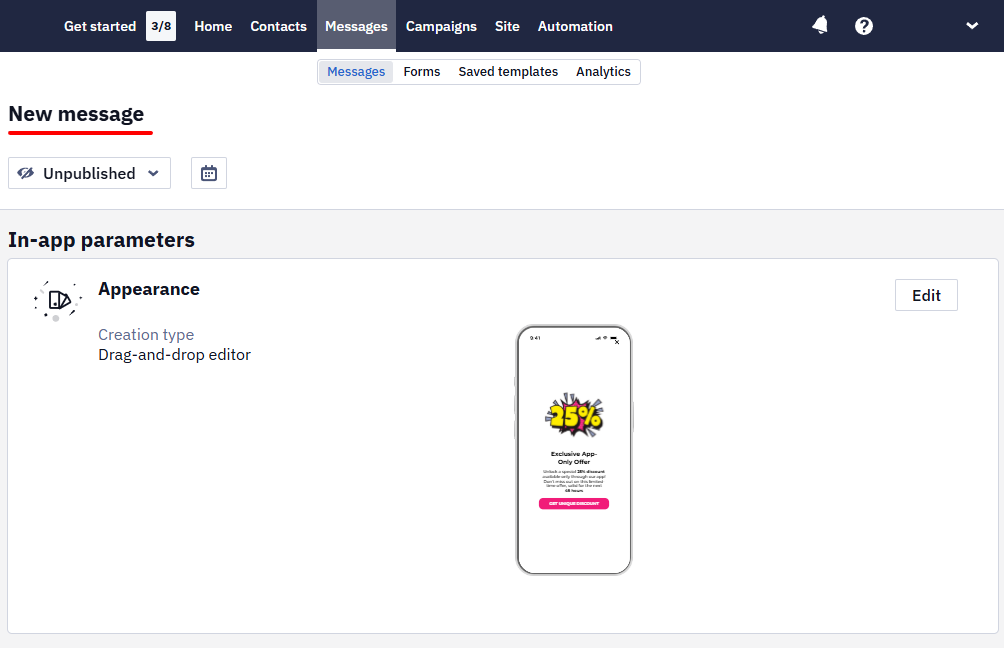
Fill in the New Message field. This field is available for searching messages in the general list; users will not see it.
HTML Editor
This method of creating In-App messages is more labor-intensive and requires specific technical skills in working with HTML and CSS; however, it provides a more flexible approach to customizing message content.
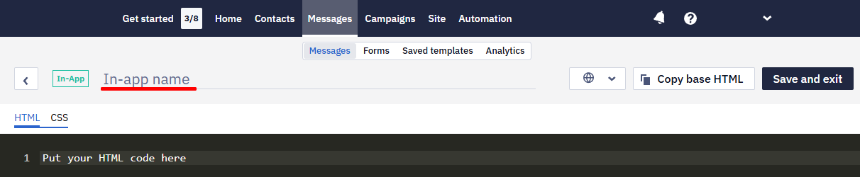
Fill in the In-app name field.
HTML Settings
Open the HTML tab.
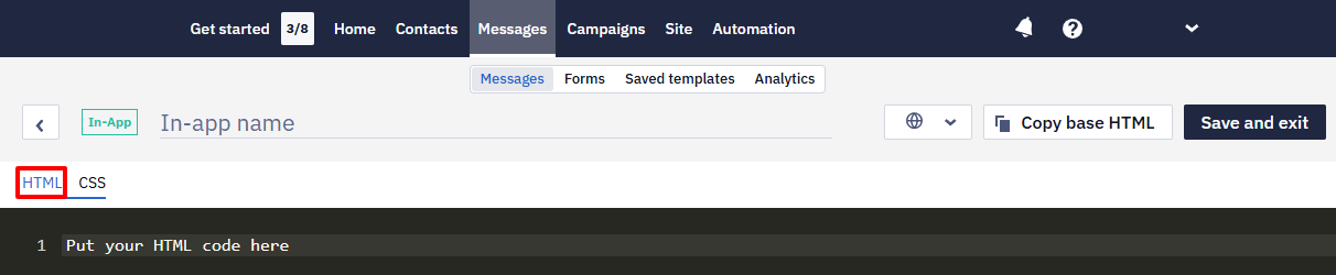
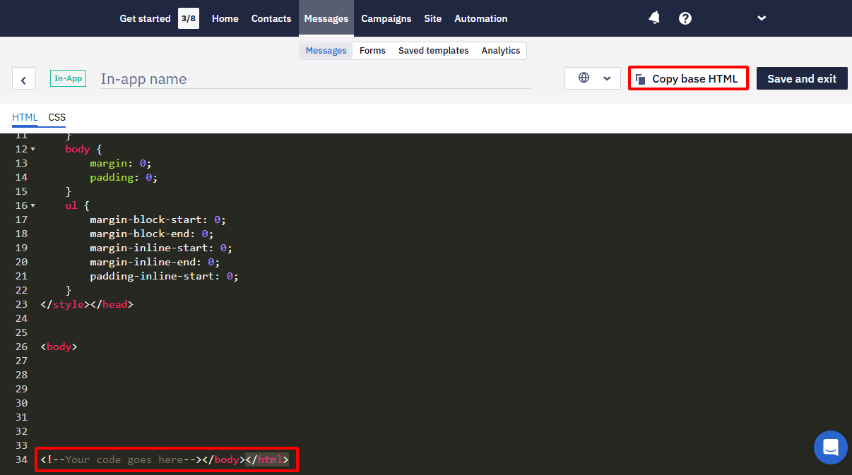
You can put your HTML code or use our base code.
Using base code
Copy and paste the base HTML into the code window. Insert your code instead of Your code goes here text.
Custom HTML markup rules
- Use buttons instead of anchors
- Set data attributes for the clickable element
Each clickable element must have the required data attributes.
-
Code of the button that should open the URL:
- \<button data-target-component-id="1c92f19e-c994-11ed-afa1-0242ac120002" data-sys-action-type="OPEN_URL" data-sys-action-params="{"url":"<https://google.com"}"> class="button"> </button> -
Code of the button that should close a widget:
- <button
                  data-target-component-id="c740db99-cfbb-4857-b790-cb5631c33255"
                  data-sys-action-type="CLOSE_WIDGET"
                  class="close-button">
  </button>
| Attribute name | Attribute value |
|---|---|
| data-sys-action-type | One of action:
|
| data-target-component-id | Generate a unique element’s UUID (e.g., using Online UUID Generator) |
Use Margin Top 50 px (approx) so the content does not overflow the iOS devices panel.
Build the message with HTML and CSS only — JavaScript in the markup doesn't run in the app, so content that depends on a script stays empty there even when the browser preview shows it.
CSS Settings
Open the CSS tab and add CSS rules in the code window.
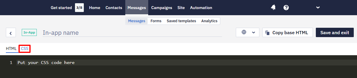
Adding CSS code is optional, but custom HTML is usually displayed incorrectly without CSS.
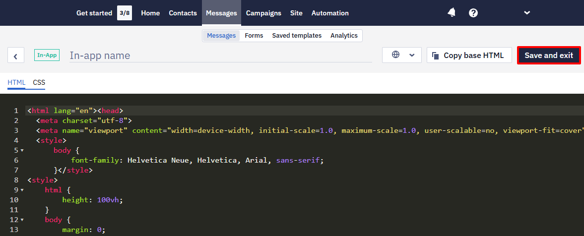
After adding the code, press the Save and exit button on the top panel of the editor to apply the changes.
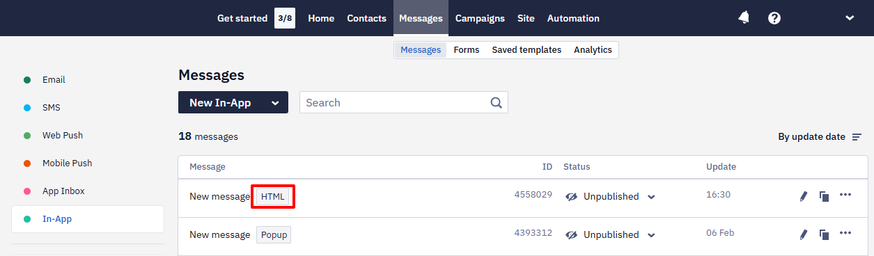
Messages created using the HTML editor are marked with the corresponding icon.
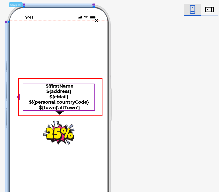
Velocity Personalization
Personalization and Velocity variables work only in In-App messages that users see after clicking a mobile push notification — in any layout type. In In-App messages shown by triggering rules, variables aren't substituted.
Variables are substituted in the message text, in button links, and in deep links.
Supports:
- resolving any context key as a root-level variable, for example
$eventParam; - fallback syntax
${key|'altKey'}, which lets you use an alternative key when the primary key is unavailable; - contact context aligned with other communication channels, including case-insensitive access to contact fields, for example
$firstNameand$FirstName.
Multilingual Version (optional)
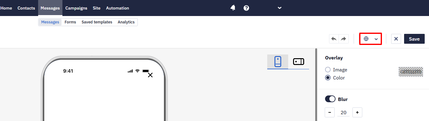
You can create multiple language message if this option is available in your pricing plan. Click the globe icon in the editor's top panel, specify the default language, and add language versions.
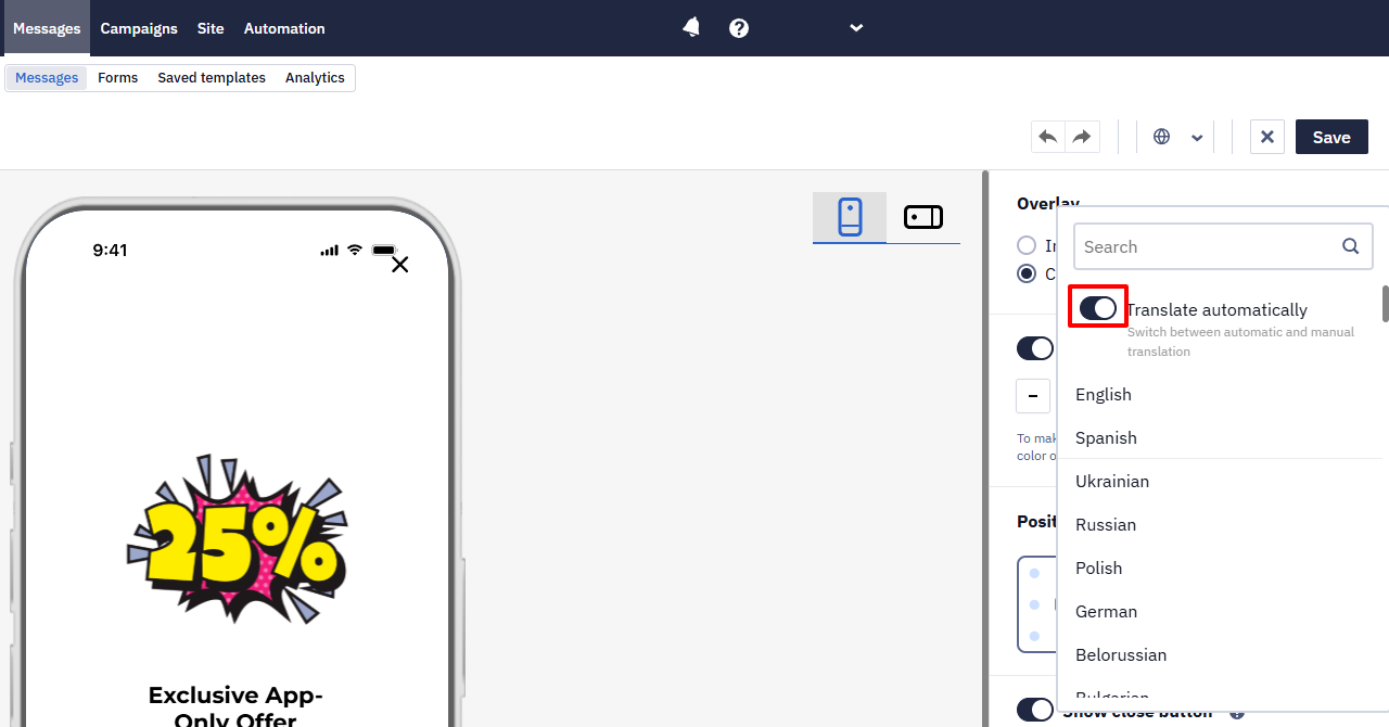
When adding a language version, the automatic translation option is enabled by default. To translate manually, disable it.
Updated 17 days ago