Setting up Widgets for Your Site
Place different widget types on your site to improve visitor interaction and collect more contact data.
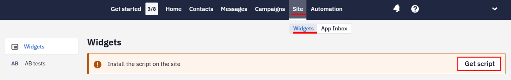
NoteTo publish widgets, install our script before the closing
More about getting and installing web tracking script >bodytag on every website page. To get a script, go to Site → Widgets, click the Get script button (available after creating your first widget), and specify your site's domain.
After installing the script, proceed to the widget creation. The listed website elements have similar settings and differ in minor nuances in preparation.
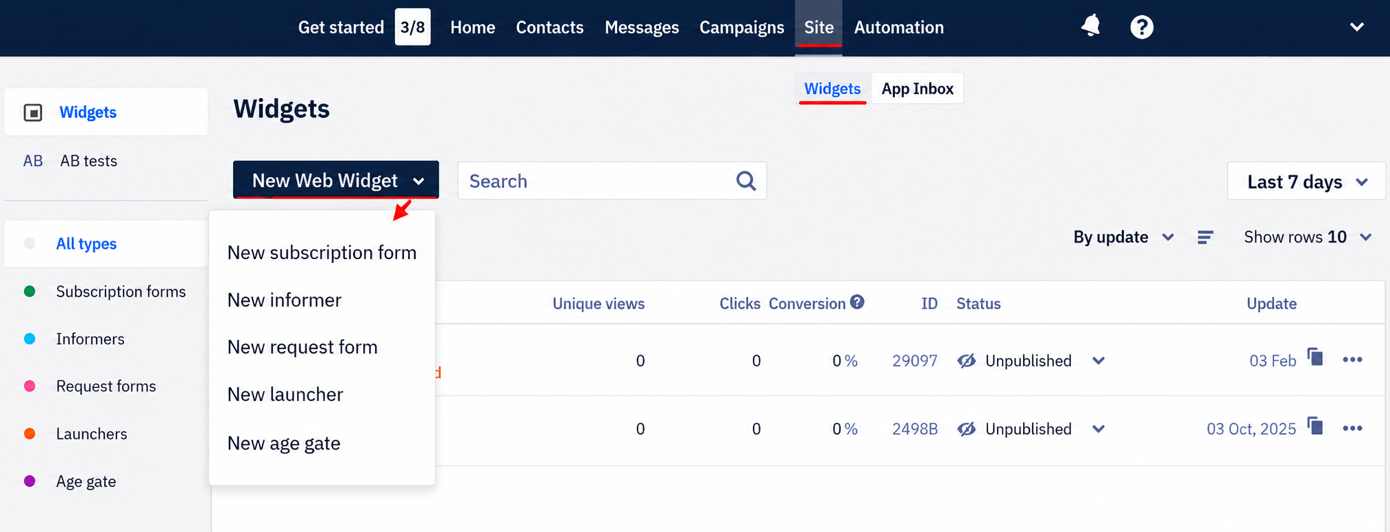
Select the widget type from the left menu or the drop-down list.
Appearance
Start widget creation with initial settings.
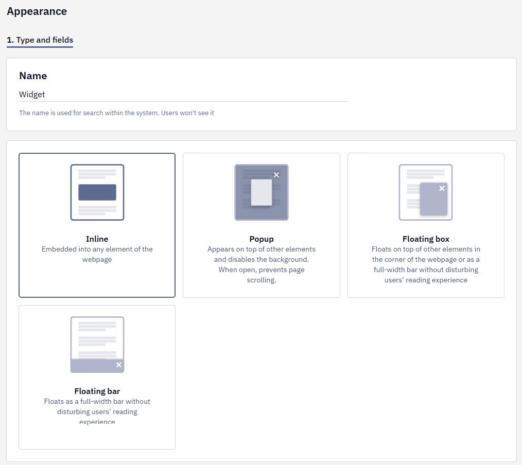
1. Name / Type and Fields
1.1. Fill in the Name field. The name is used for search within the system. Users won't see it.
1.2. For subscription forms and informers, select the type from the available options:
- Inline — embedded into any element of the webpage
- Popup — appears on top of other elements and disables the background. When open, it prevents page scrolling.
- Floating box — floats on top of other elements in the corner of the webpage or as a full-width bar without disturbing users’ reading experience.
- Floating bar — floats as a full-width bar without disturbing users’ reading experience.
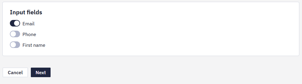
1.3. For subscription forms, activate the widget’s input fields.
1.4. Click the Next button.
2. Style (skipped for launchers)
2.1. To create a widget based on your website style, select colors and style. The system will generate a widget based on your settings.
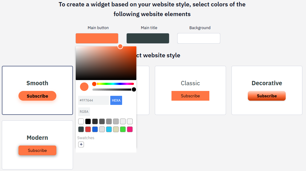
2.2. Click Next.
3. Select Appearance
Select the appearance style for the element. Each widget type has different options.
NoteSelect the most appropriate option. You’ll be able to edit it as needed.
Widget Editor
You have various tools to customize the widget’s style and elements.
Basic Actions
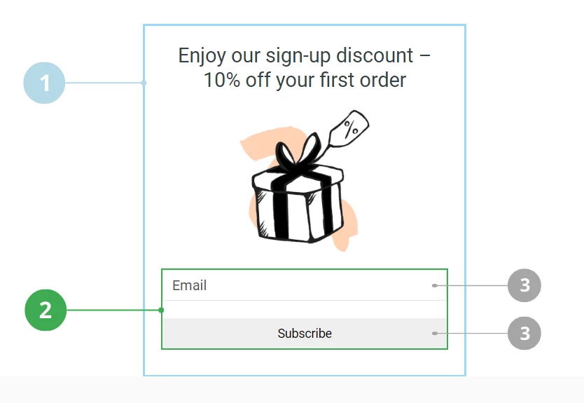
The widget structure has 3 levels:
- State.
- Container (for some types of widgets).
- Element.
When you click the right mouse button on the widget element, the following basic actions become available:
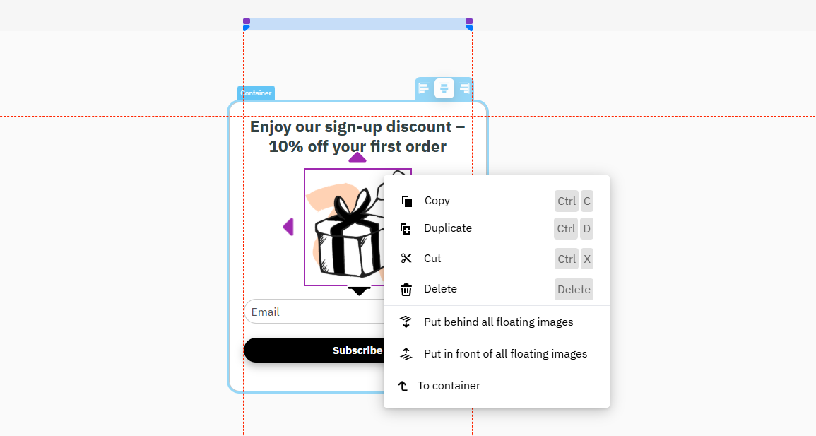
- Copy
- Duplicate
- Cut
- Delete
- Put behind all floating elements
- Put in front of all floating images
- To container
Top Panel
The top panel menu contains buttons with the following functions:
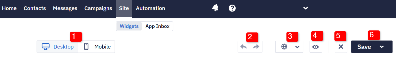
- Switch to the desktop/mobile version.
- Undo/Redo
- Multilanguage settings:
- Form appearance is set up only in the version with the default language. Then it's automatically applied to other language versions.
- In other language versions, you can only change the text.
- The form is displayed in the site language, which is determined by the value of the
langattribute in thehtmltag. If the page code doesn't contain it, then by the browser language.
- Widget preview.
- Close without saving.
- Save button.
Left Panel
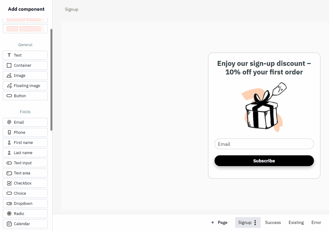
On the left side of the screen, you can find the components of the widget you are creating. The editor works as a drag-n-drop constructor. If you need to add any element, left-click on it and drag it to the appropriate place of the widget.
The NPS/Rating and gamified components described in the separate articles.
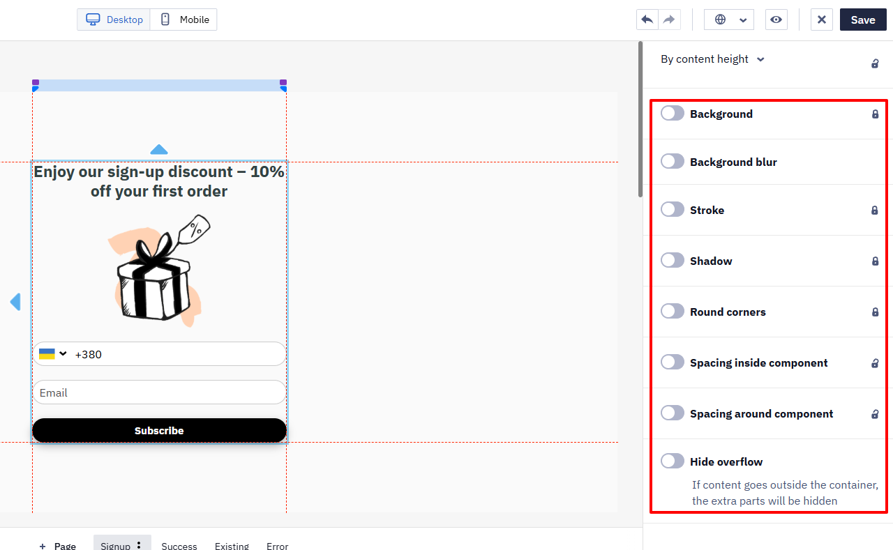
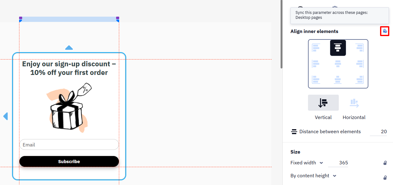
Right Panel
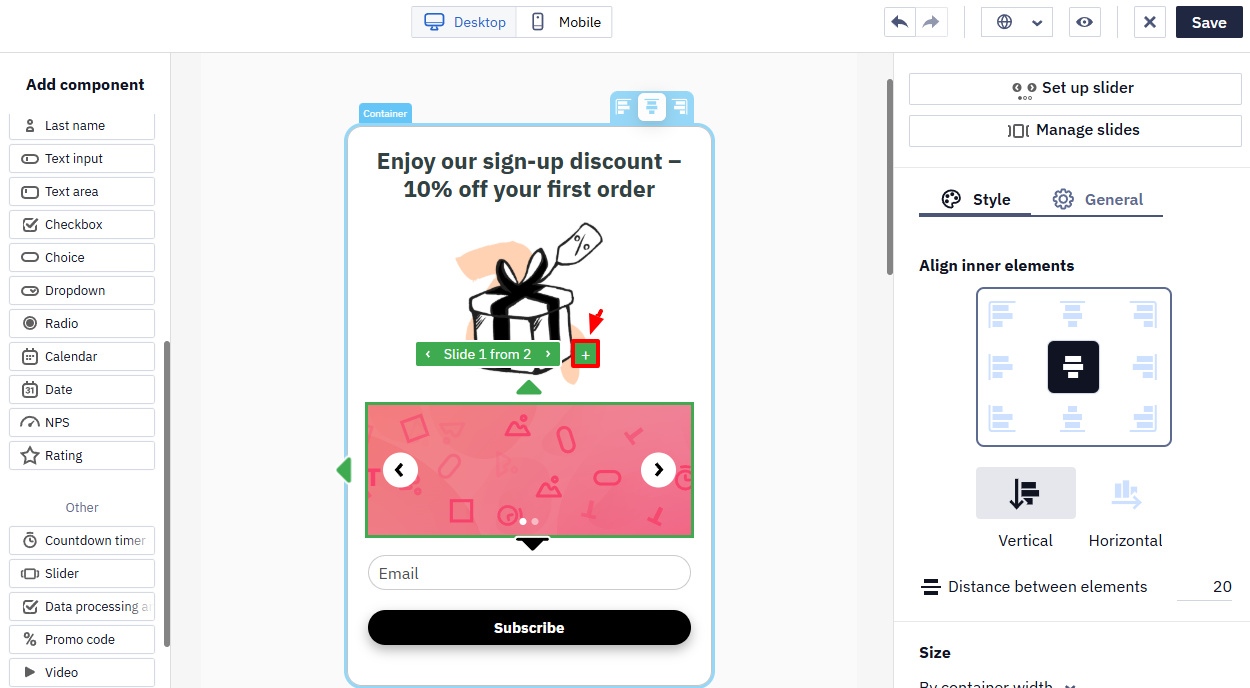
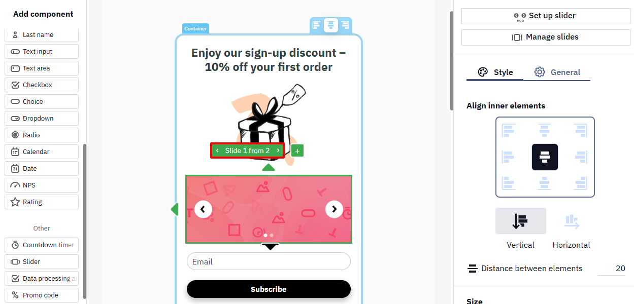
When you don't have any widget items selected, you will see design settings on the right side of the screen. These settings apply to the entire widget:
- Align inner elements
- Distance between elements
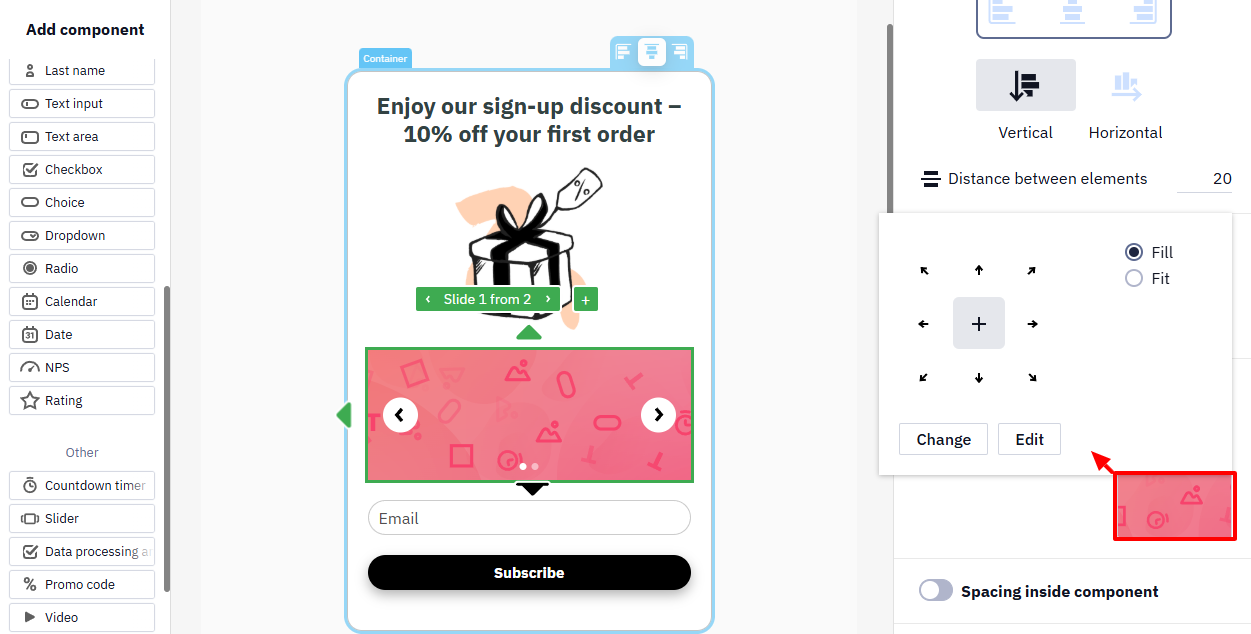
- Size
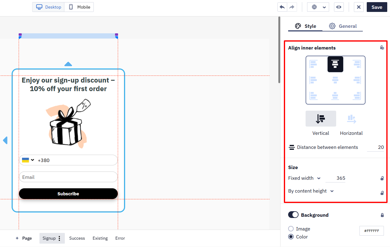
- Background
- Stroke
- Shadow
- Round corners
- Spacing inside component
- Spacing around component
- Breakpoint
Launcher settings:
- Action on click
- Positioning
- Entry animation
- Loop animation
- Z-Index
NoteSettings marked with a lock icon sync parameters across pages. You can change the synchronization setting by clicking the icon and selecting the needed option.
Editing widget elements
If you want to edit individual widget elements, just click on the desired element.
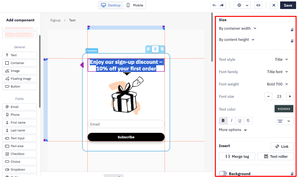
Text settings
To edit text , click on the widget element with some text. The following panels will appear on the editor's right.
Note
- By default, widgets use the font set on your site as the primary font.
- The Text roller element allows you to animate the scrolling of text in a widget, which additionally attracts users' attention and allows you to convey more information in a compact format.
- Merge tag is used to personalize widgets with data from the site.
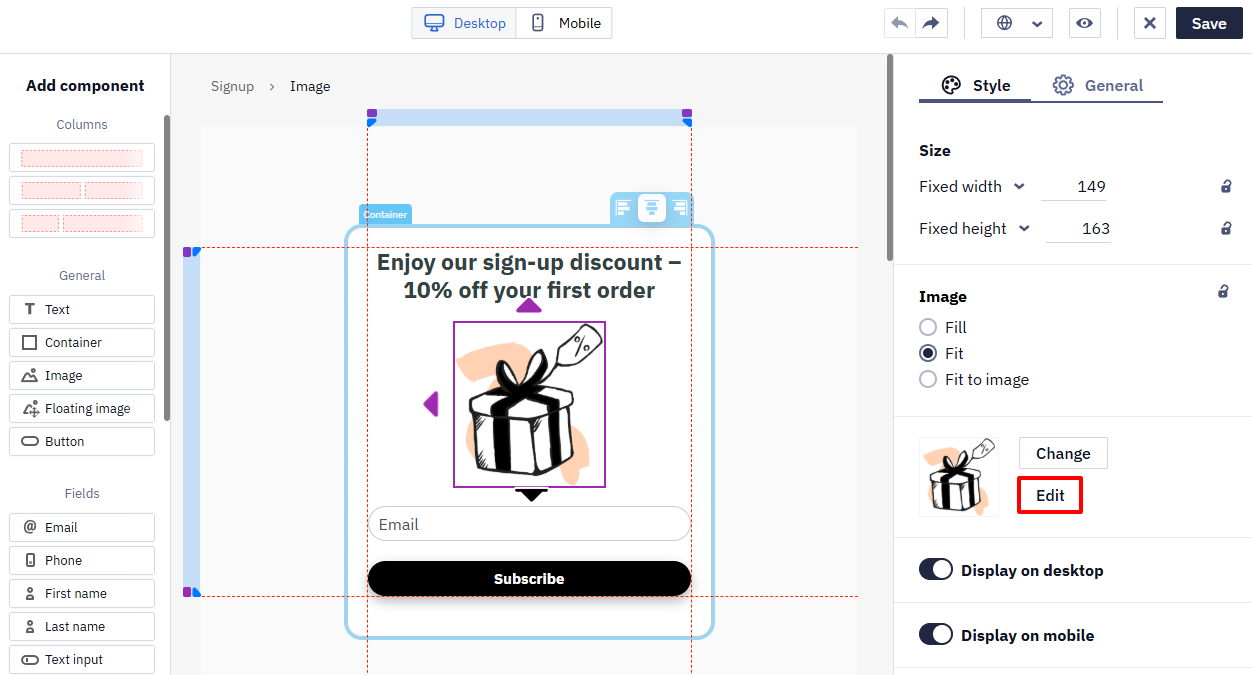
Image customization
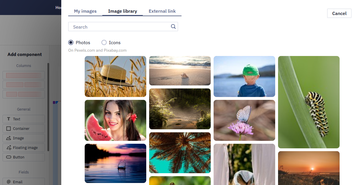
To open image style settings, left-click on the image. You can upload your picture, choose a suitable one from the library of free photos and icons, or enter the URL of the image you want to embed. External URL allows you to keep the referenced sources up-to-date. For example, promo actions or products on a site.
NoteUpload images in
PNG,JPEG,SVG,GIFformats, up to 3 MB
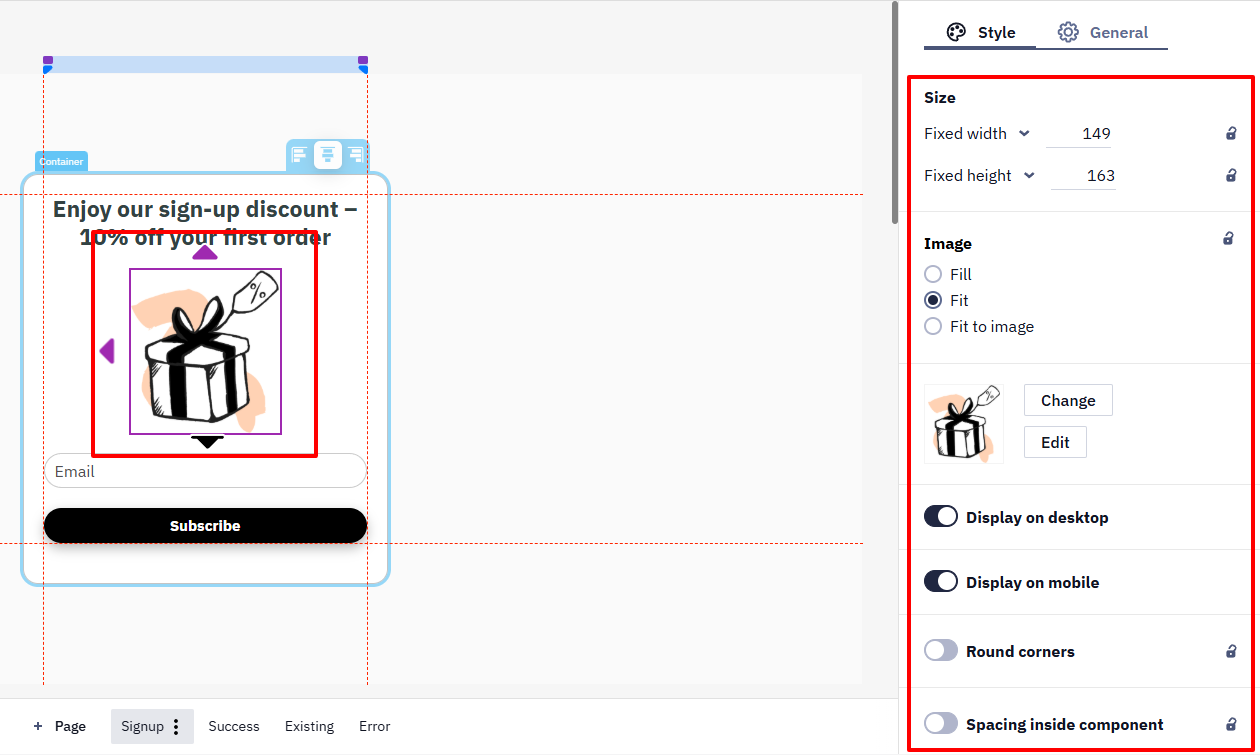
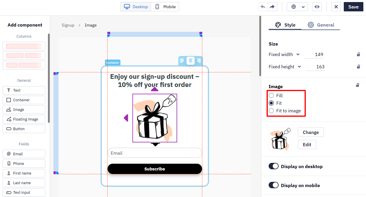
In addition to the standard settings, positioning customization is also available for images:
- Fill,
- Fit,
- Fit to image.
NoteYou can edit the image directly in the editor when uploading (if it does not meet the requirements) or after uploading (the Edit button). After editing, the image is saved in PNG format.
Slider settings
Drag the slider from the left-side panel and drop it into the widget’s template. Set up slider and Manage slides buttons will appear on the right-side panel.
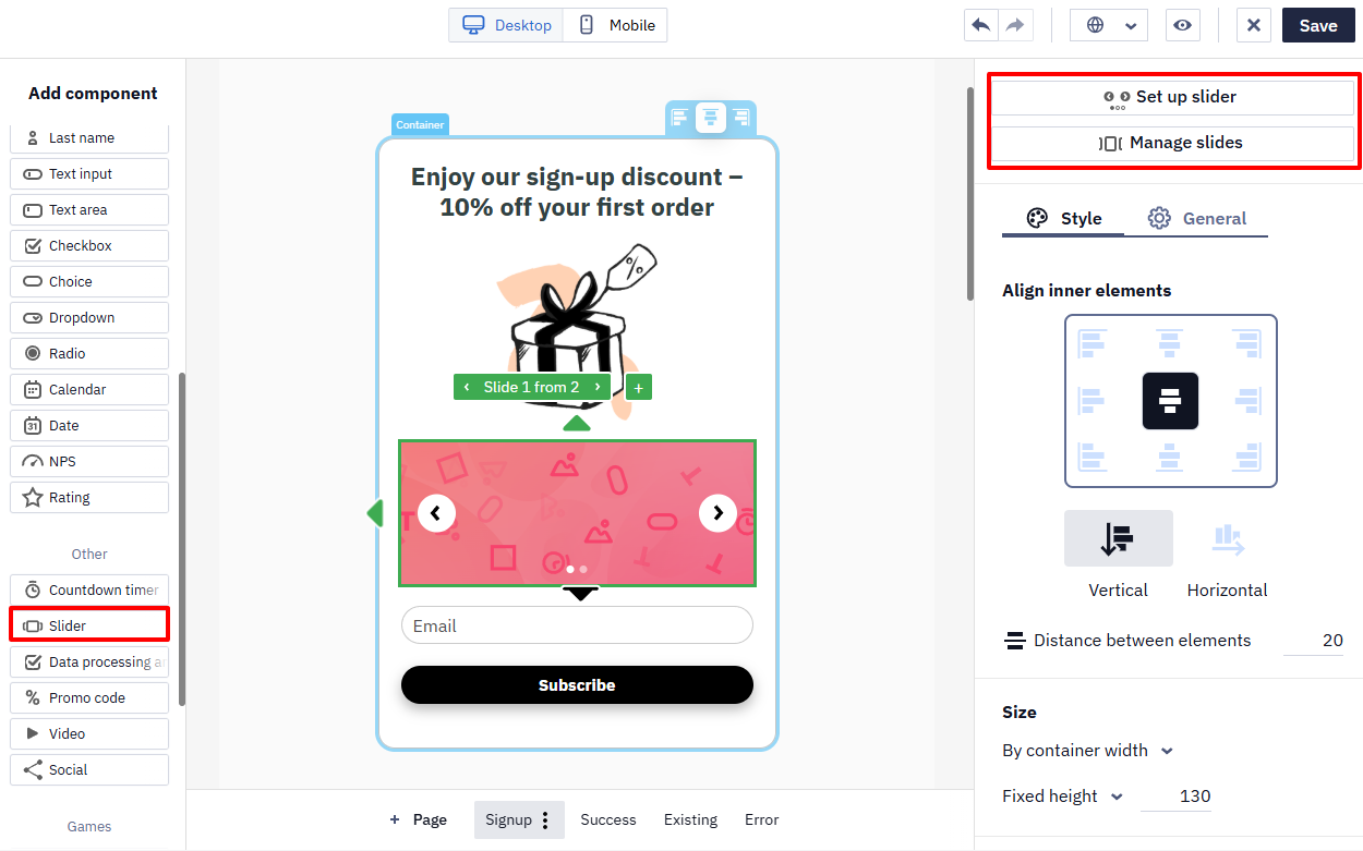
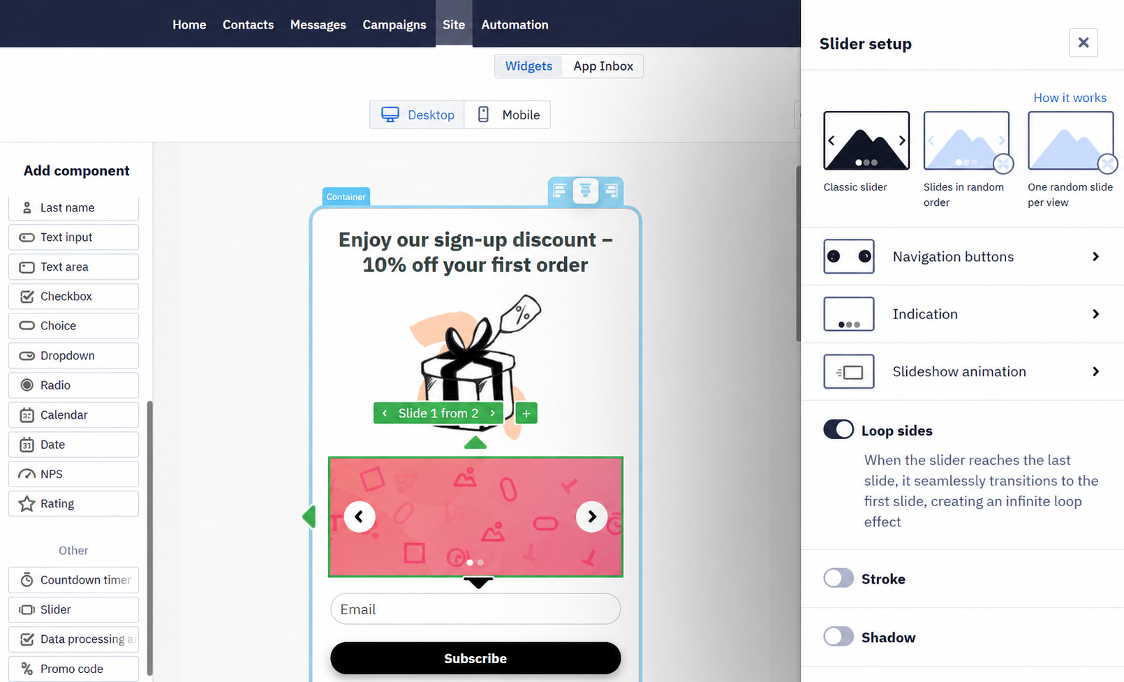
- Set up navigation buttons, indication, slideshow animation, and general slider’s design in the Slider setup window.
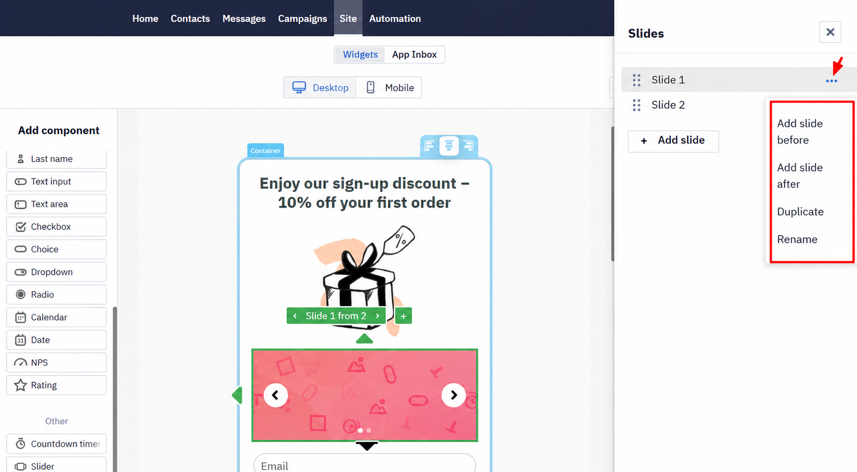
- Manage slides’ order, add, duplicate, or rename slides after clicking the Mange slides button.
Also, you can add a slide by clicking on the + sign.
To change or edit an image, click on it in the template, after which it will appear in the right settings panel. Clicking on the image from the slider in the settings panel opens the editing and editing window.
Use navigation buttons to switch between the slider’s images.
General tab
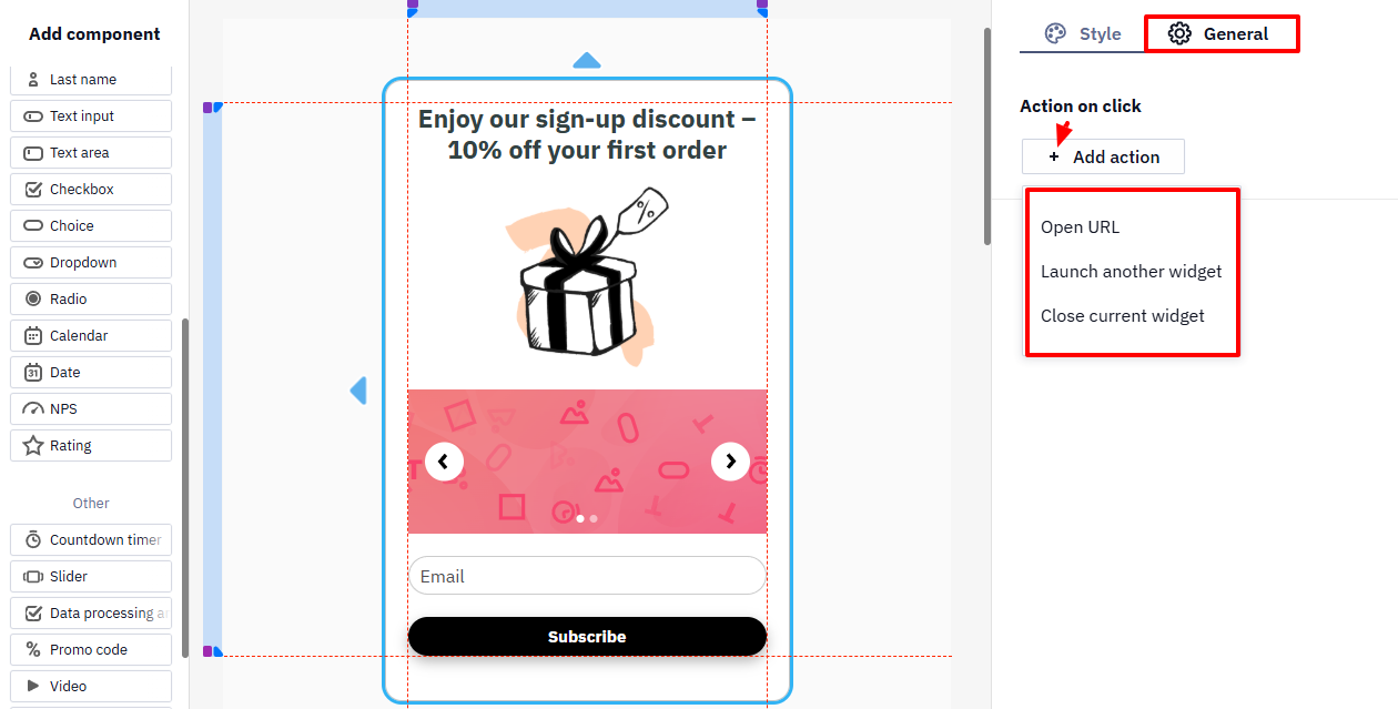
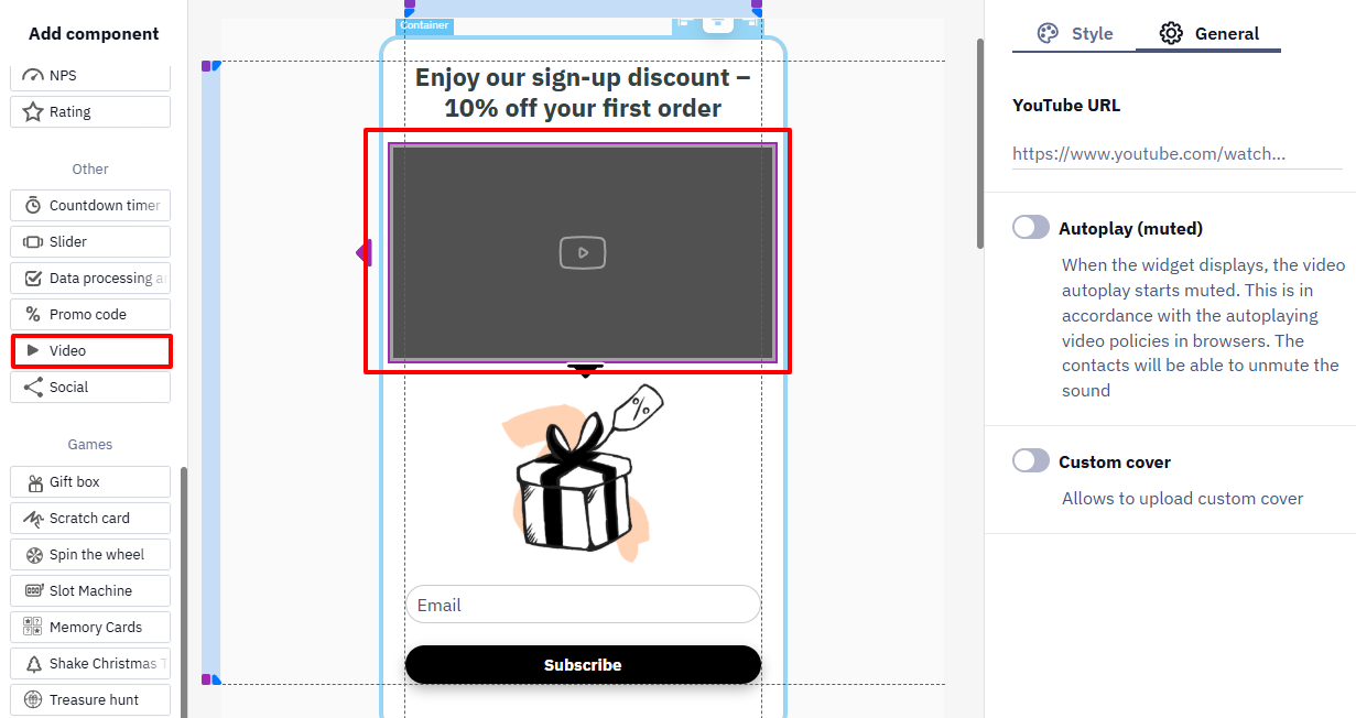
Click on the widget's element to see the General tab with such settings:
- Action on click
- Contact fields validationand placeholder
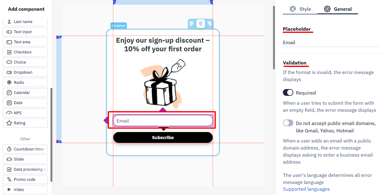
- Video settings
Creating Multi-Step Widgets
Multi-step widgets are used to make the subscription process on a website more convenient and efficient. Their main purposes are:
- Increased Conversion: Breaking up many fields into multiple steps makes the process less tedious for the user.
- Improved User Experience: Presenting information incrementally seems more manageable than filling out a long form on a single page.
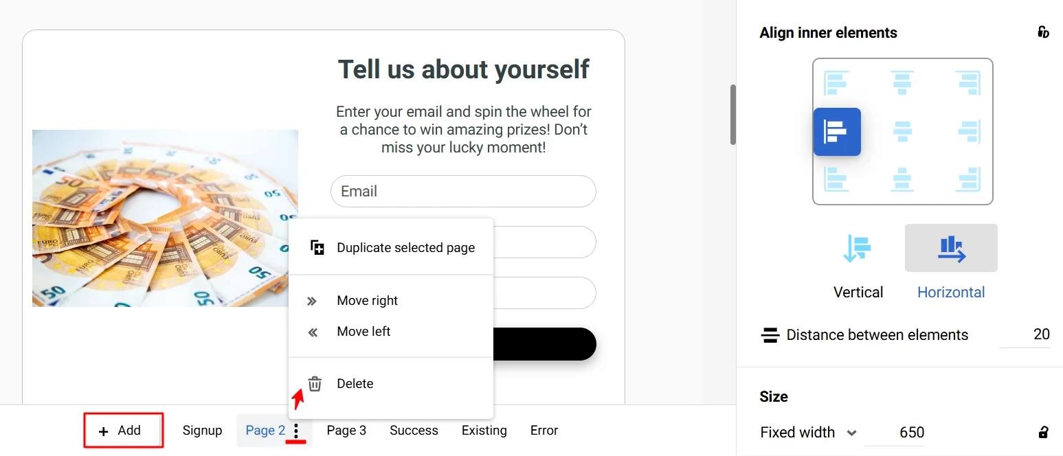
To add a page to the widget, you can use the buttons
- Add — to duplicate the current page,
- Three dots on the additional page to duplicate it (here you can also move the page left or right or delete it).
Note
- Multi-step forms are available in all widget types except launchers.
- A widget can have only one game component.
- Only one widget component can write data to one contact field.
- In the Popup and Floating box widgets, the default page is Teaser.
- The maximum number of pages is 20.
Widget Placement
- The age gate takes the size of the screen and completely overlaps the pages of the site until the user confirms their age, so this widget has no placement settings.
- The positioning of a launcher is configured in the appearance editing window.
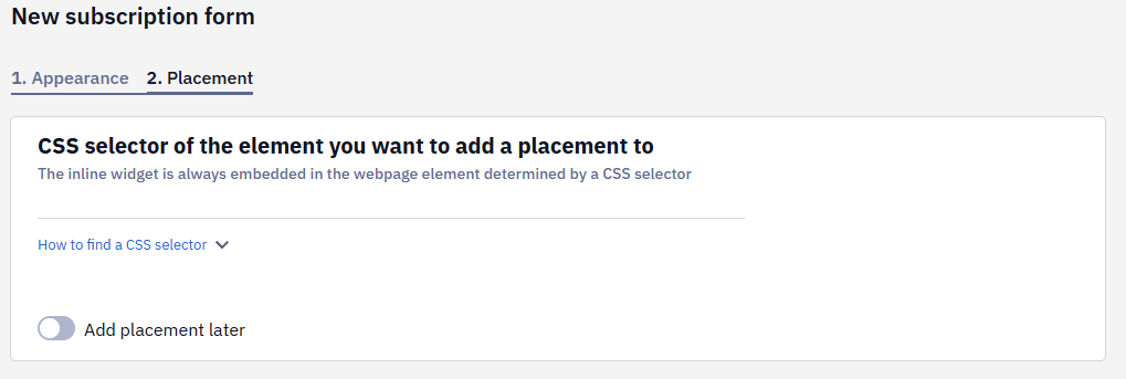
- To specify a positioning of a subscription form or informer, enter the CSS selector of the element you want to add a placement to. This tab appears after you have customized the widget's appearance and clicked the Save button.
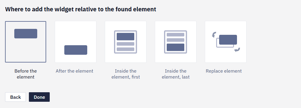
- Select where to add the widget relative to the found element:
- Before the element
- After the element
- Inside the element, last
- Inside the element, first
- Replace element
NoteYou can insert up to ten embedded forms on one page, which is especially useful for long articles or landing pages.
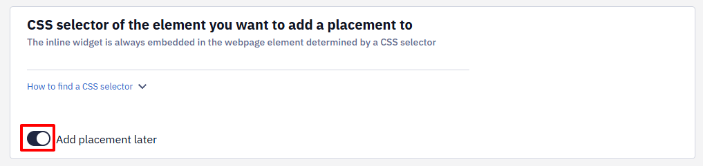
If you are not ready to specify the widget placement, activate the Add placement later switch.
- Click Done. Initially, the form will be visible only to you; on the Parameters tab, you can make it public.
- Create additional placements as needed.
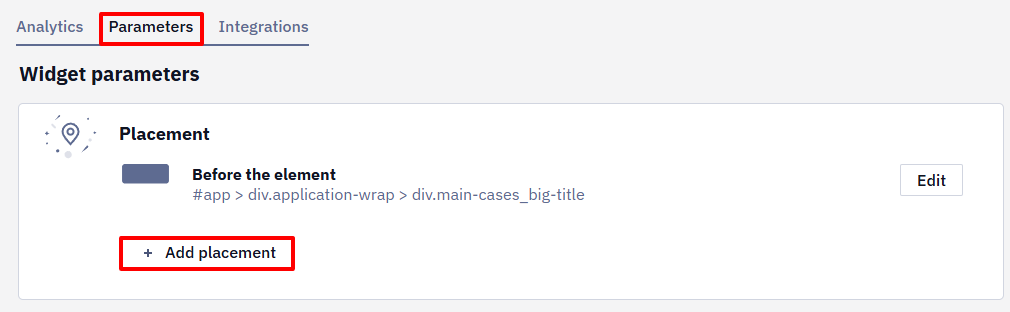
Widget Parameters
In the Parameters tab, you can:
- Edit the widget's appearance.
- Edit the placement of the form or informer.
- Configure widget calling conditions.
- Configure the actions after the user has subscribed or clicked on the launcher.
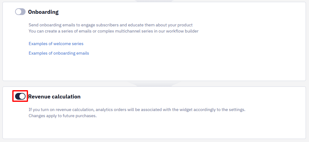
- Activate or deactivate the calculation of the revenue from the widget (the settings are described in the instructions).
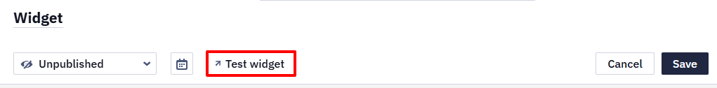
Widget Posting on the Website
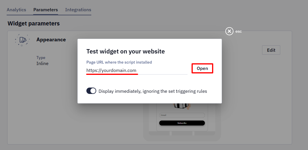
- Having saved all the settings, check how visitors will see the widget on the site — click on the Test widget button.
- Enter the link to your website and click Open.
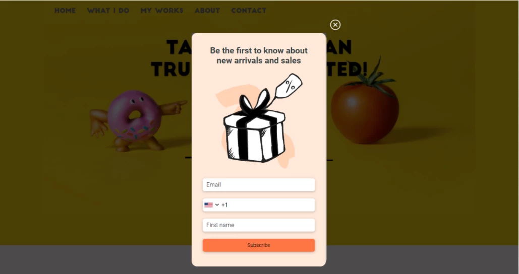
- If all steps are successful, the widget will be displayed on your website according to the specified conditions.
- After testing the form, publish it by clicking on the Published button, then click Save.
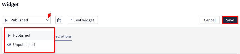
Click the Unpublished button to stop displaying the form, then save the changes.
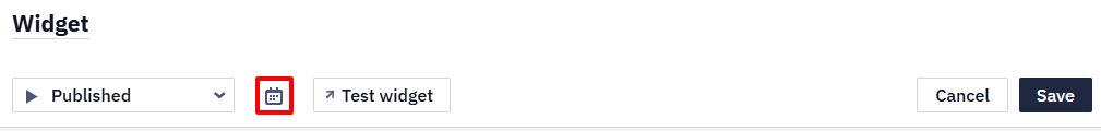
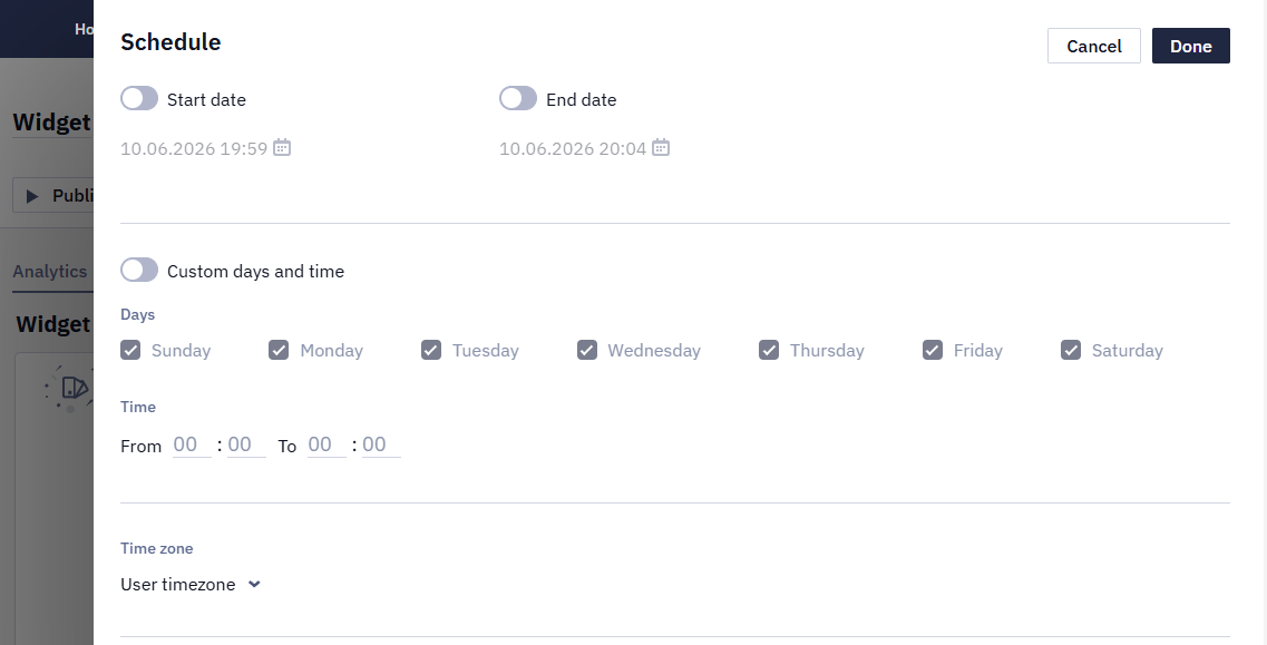
Also, you can specify the widget’s schedule by clicking on the calendar icon.
The schedule includes the following settings:
- Start and end dates
- Custom days and time
- User timezone
Widget statuses are displayed in the general list and in widget details:
- Published — for published widgets with a current or no scheduled period
- Unpublished
- Scheduled — the publication period is planned for the future
- Expired — the publication period has expired
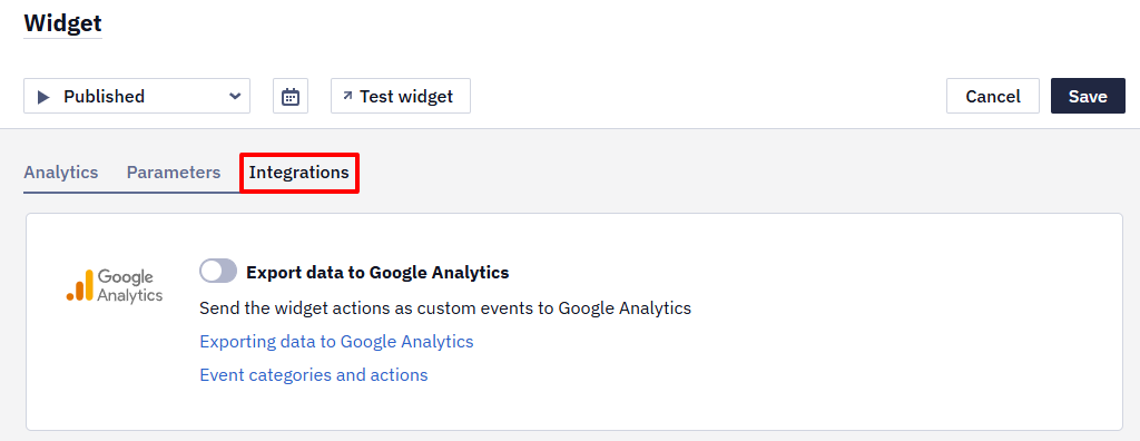
Widget Integrations
In the Integration tab, you can configure sending widget actions and custom events to Google Analytics. Note that integration is only compatible with Universal analytics script, set directly on the website.
Learn more about exporting data to Google Analytics >
Further settings include:
Updated 22 days ago