
NPS/Rating Widget Components
NPS (Net Promoter Score) and Rating widget components are used to collect feedback from website visitors and assess customer loyalty to your brand or company.
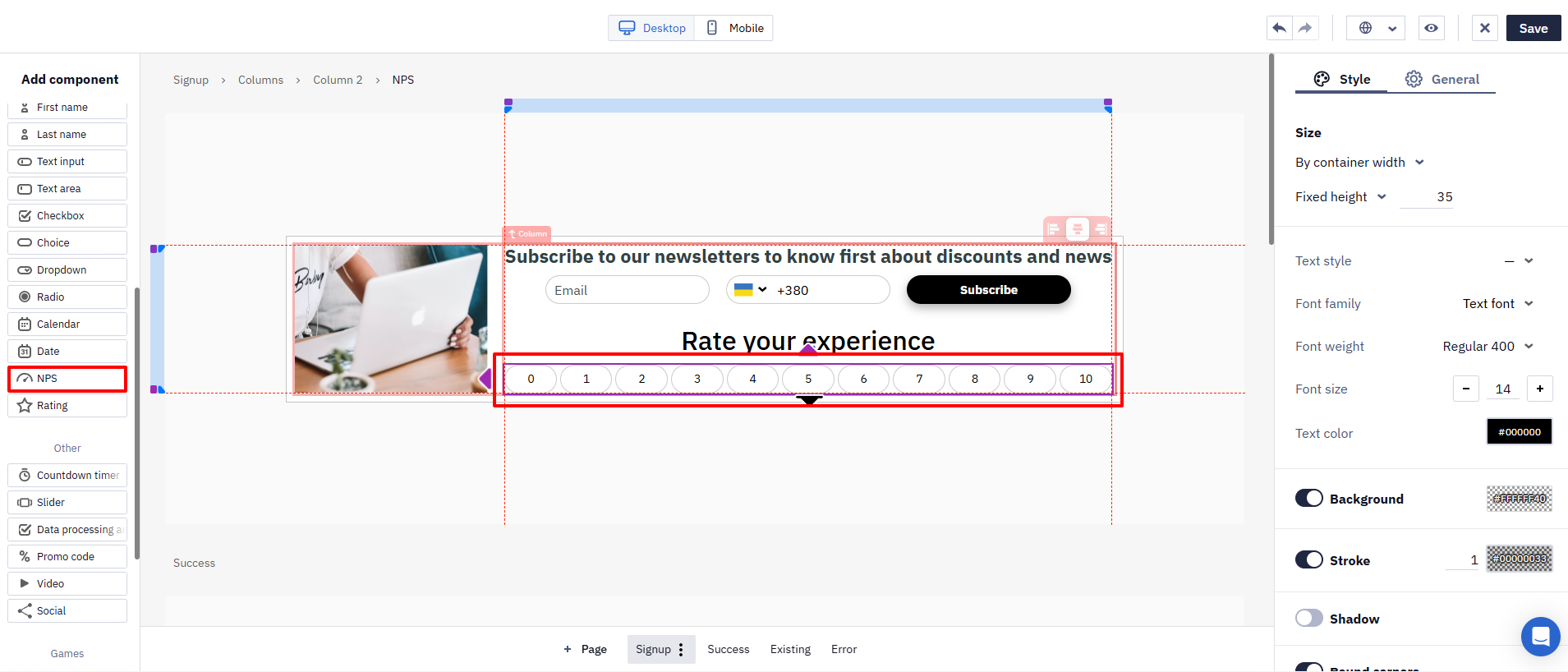
- NPS is a rating scale from 0 to 10.
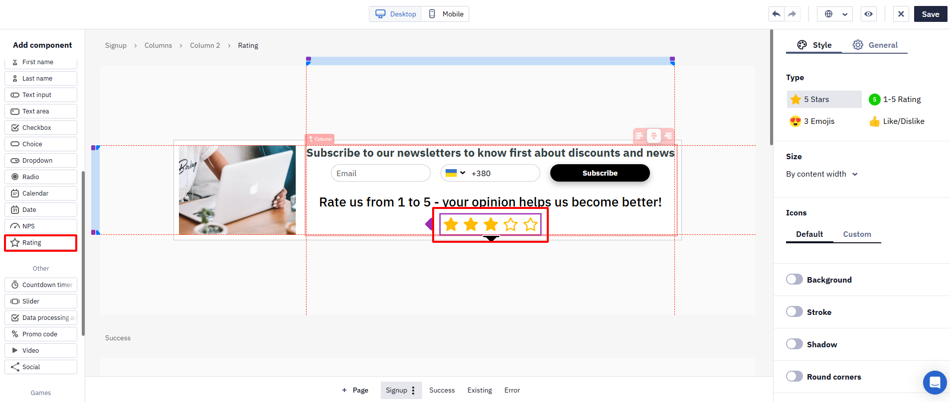
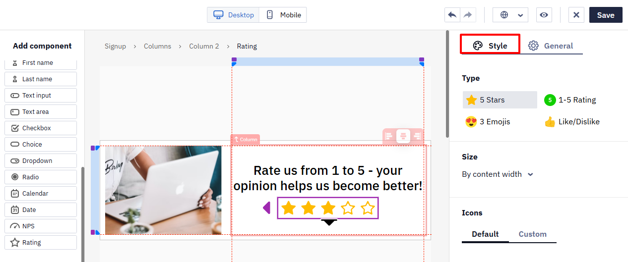
The Rating includes four types of responses:
- 5 stars,
- 1-5 Rating,
- 3 Emojis,
- Like/Dislike.
NPS Survey Branching
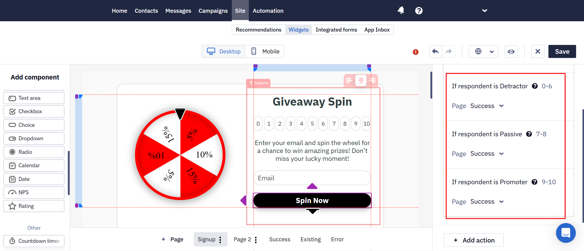
In a multi-step widget, the next page can depend on the score selected by the user. This allows you to collect not only a numerical rating but also additional feedback based on the response.
For example:
- score from 0 to 6 → ask what caused the negative experience;
- score of 7 or 8 → ask what could be improved;
- score of 9 or 10 → invite the user to leave a public review.
Create separate pages for the required outcomes and configure a transition to the corresponding page for each score. Depending on the response, you can display different CTAs, promo codes, thank-you messages, or information about the next steps.
ImportantIn mobile channels, the built-in survey works only in App Inbox. The link to the survey is a service link that has to be processed the same way as in an email, which isn't possible on the application side:
- in a mobile push, the link doesn't open — the app expects a transition inside itself, while the link leads to a browser;
- in an In-App message, the link returns a 404 error.
Settings Data Storage from Widget Components
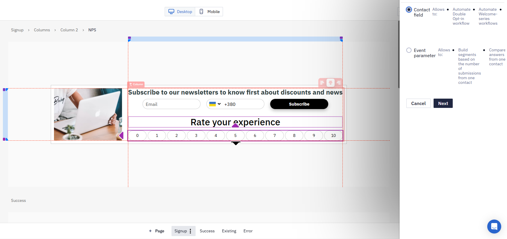
After adding the component to the widget, select the data processing method: Contact field or Event parameter.
The following values will be sent to the contact field or event:
- For NPS — a number from 0 to 10
- For Rating — depending on the type:
- 5 stars / rating 1–5: a number from 1 to 5
- 3 emojis: a number from 1 to 3
- Yes / No: value in Yes/No format
Contact Field
When you select this option, the widget components send data directly to the contact’s profile.
More about storing data from widgets to contact fields >
Event Parameter
If you select the Event parameter option, the system stores component values in events, not in contact fields. After you submit the form, it records all data, including the component values.
For example, a contact filled out the form with an email and phone number and selected a score of 8 in the NPS component. The event parameters will then look like this:
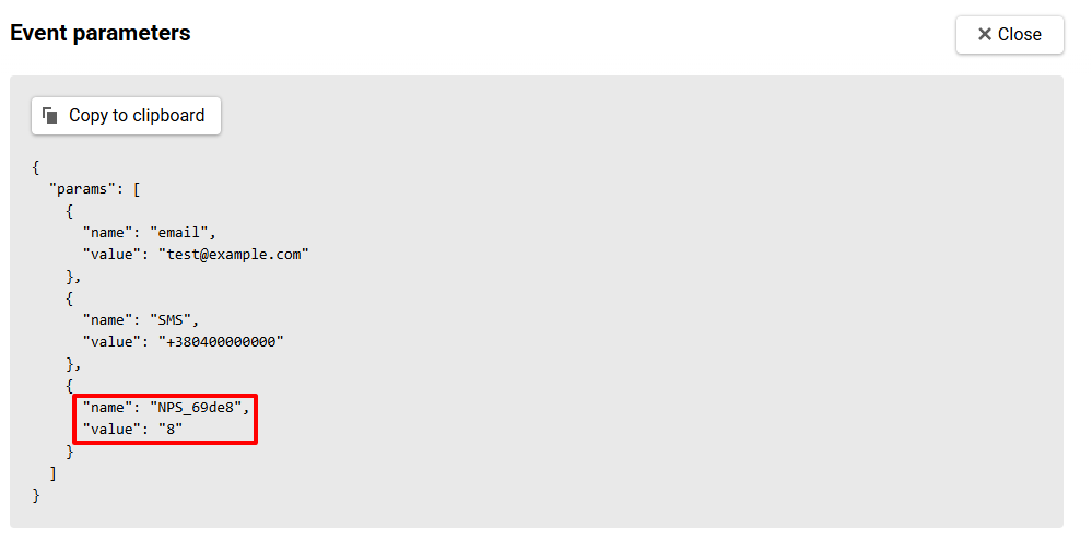
Saving data from components in events allows you to:
- Build segments based on a contact’s response scores.
- Compare different responses from the same contact (for example, over time or across various forms)
- Use event data to personalize messages.
To set the event parameter:
- Select an existing event from the list or create a new one if needed.
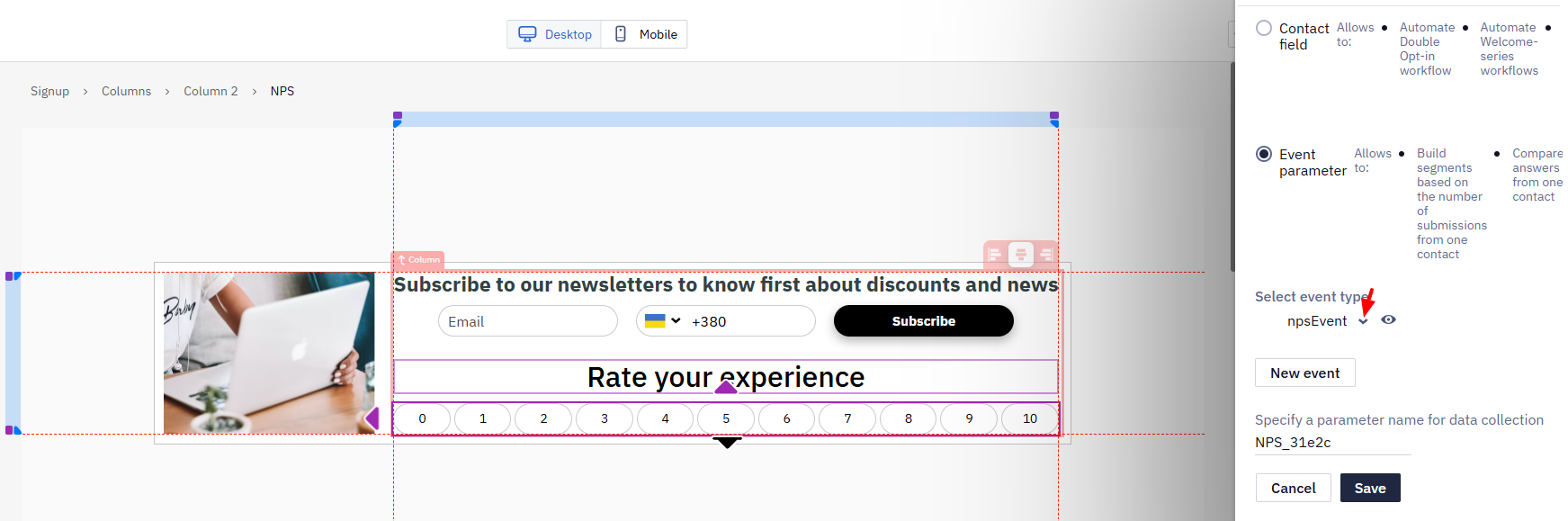
NoteYou can use multiple components in a widget simultaneously and assign the same or different event types to each. If the form contains two components, two events will be created:
- The first event will include all contact data and the value of the first component (for example, rating the order processing speed);
- The second event will include the same contact data and the value of the second component (for example, rating the quality of support service consultation).
- Specify the name of the event parameter in which the component’s value will be sent, or leave the default name, then click Save.
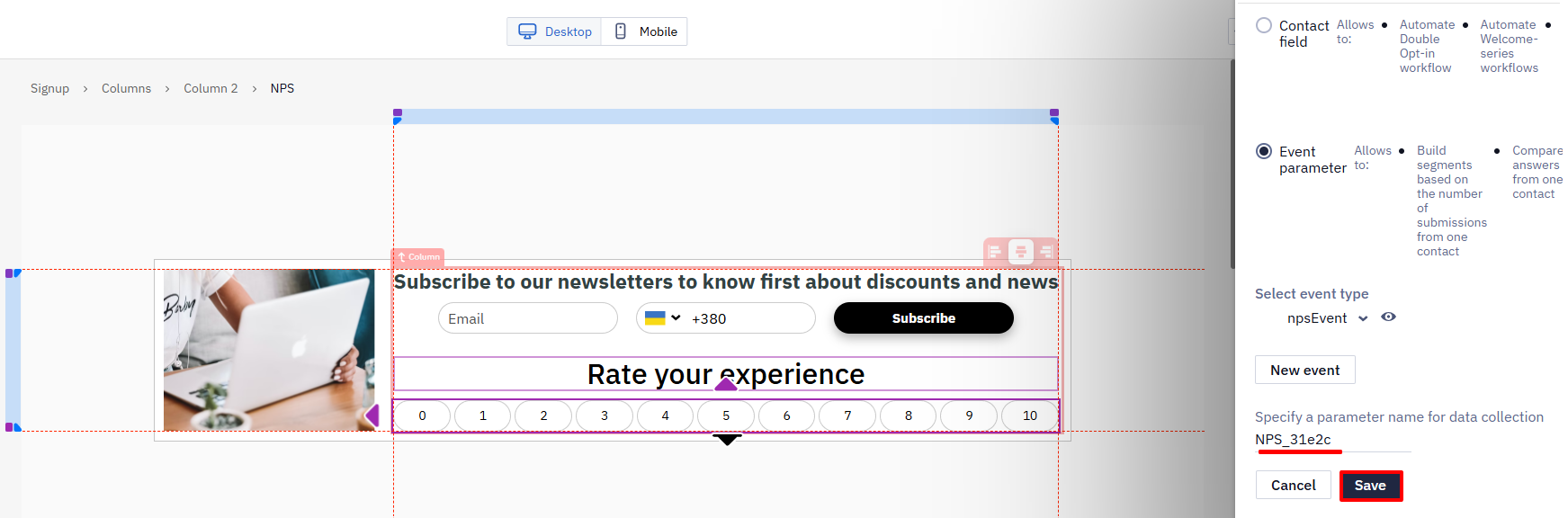
Component settings
Component settings are the same.
On the General tab:
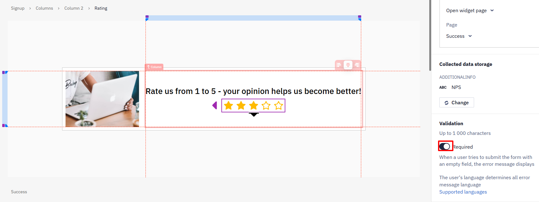
- Set an action on click:
- Open widget page — select one of the widget pages,
- Open widget page based on answer — select a widget page for each respondent's satisfaction level.
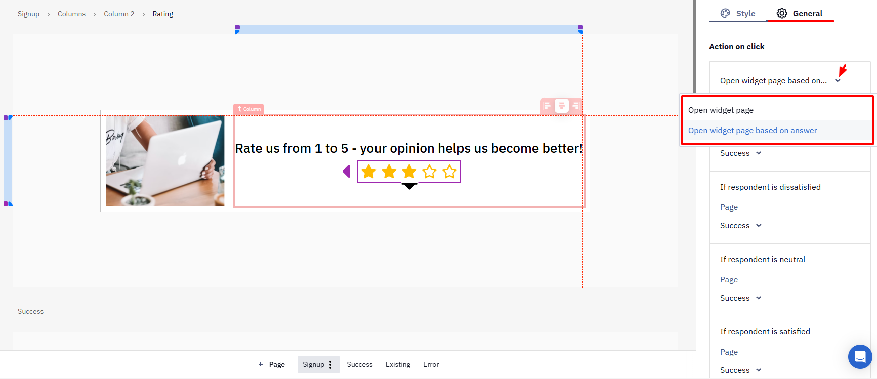
- Determine whether the field is required.
- On the Styles tab, customize the appearance of the component. For the Rating component, you can upload a custom icon for each response type.
Updated 2 months ago